They do display in columns but the charts aren’t displaying in a ‘responsive’ way. (the image is squished instead of how they display in mobile version)
Is it possible to display two charts next to each other?
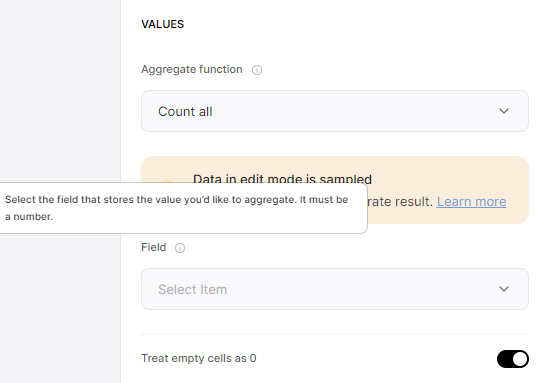
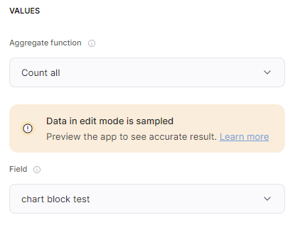
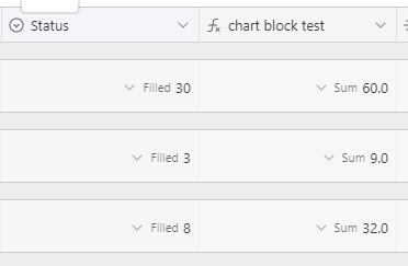
Question: so a ton of the data that our org wants visualized in a dashboard is in the form of counting how many records in a table have a certain status tag so like # items “pending” vs # items “QC” etc. I was excited when I saw that you could aggregate information, but when I’m playing in the app it looks like I can’t have it aggregate based on a tag?
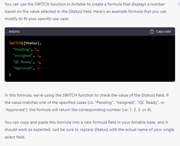
would the proposed workaround be to make a formula with a number for a tag value?
@rebeccajane it’s a bit tricky with react blocks and dom size changes. I would suggest waiting a bit, as we will be enabling side-by-side sooner or later we have too.
Can you go to this thread to comment and show me what are the code used? (there should be 3 of them). If I start debugging here, the thread is going to be overwhelmed.
Also, can you confirm that this happens on a desktop view and not mobile or tablet devices?
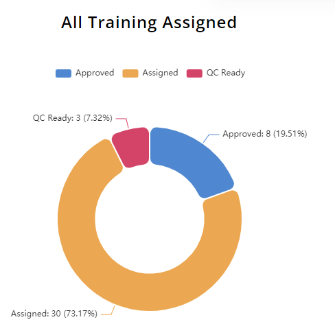
Hi @austinyang I think it was working for a little while but now I’m running into new issues where it’s saying “not enough data to show a chart yet” but the number of records that it should be aggregating are 40, using a single select status field for the same donut chart above. Do you guys know what the conditions are that cause that “not enough data” to show up?
I am speaking with support and being told now that the only fields working for aggregation functions are still numbers or formulas, so I’m confused what you mean by the “count function is fixed of last week” haha… I may be misunderstanding your meaning I’ll go back to my initial GPT/formula workaround for now
Hello Diana, I see you’re discussing this one with the support team already. Aramayis just suggested a temporary workaround for it, and I’m following up with the engineering team to understand what happened here. I’ll keep you posted.
@danyalamriben oops this fell through the cracks. Just following up to see if the issue still persist? I believe counting values from Airtable dropdown fields should now work correctly.
I believe I got it to work by playing with the filter settings; the filters I used for other blocks without issue weren’t cooperating as easily for the chart block, but switching to referring to record_IDs seemed to fix most of that. The more disappointing issue using these was learning that the charts aren’t reflecting the live data, and on a schedule to refresh every 15 minutes. I was receiving a lot of bug reports from users and thinking the block was not functioning until I learned of this detail.
Is there any way to force a chart to update? Through custom code, or some other way?
I’m in the same boat as Dany above. Users are very confused when they update information, why their charts are not accurate.
Still waiting for the data to update: 31 minutes in.
The data inside the studio builder is correct. I’ve ‘refreshed’ it there, published new changes, updated the data via softr & via airtable to see if it could catch any of the updates. Nothin.
Right now, I think my only option is to wait and see. But this is a huge issue for me if theres no way to tell the charts to update on page load.
In order to perform this you need a page reload each time users update their information.
Insert this code in the page settings => custom code => footer.
Just replace list-details3 by the name/ID of the block where the update comes from (update action button or one click update action button)
hey Everyone! Thank you so much for the help and approaches. Unfortunately, none were the right fit for the following reasons.
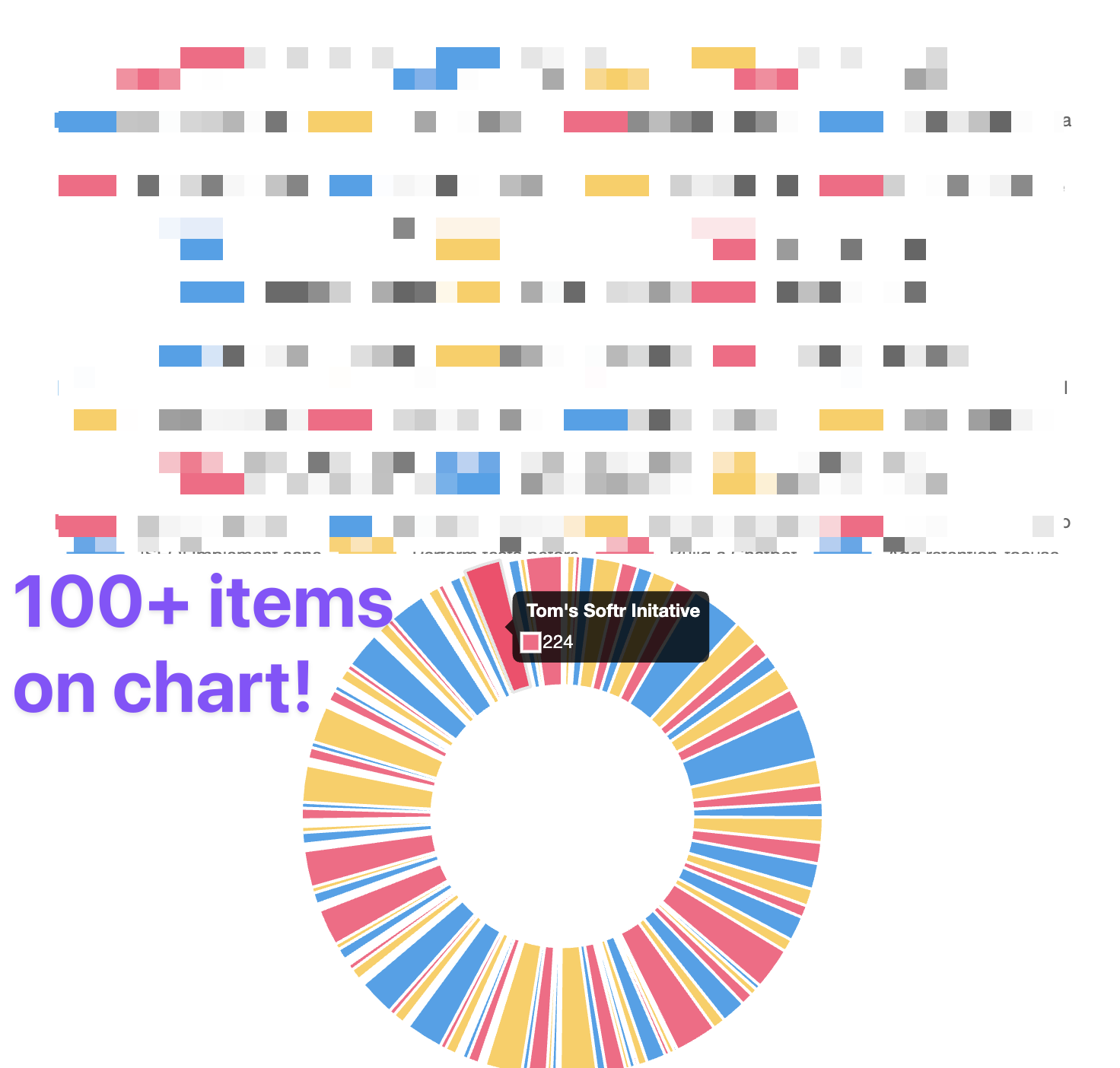
I needed to represent more than 99 items in the chart
Even the ability to refresh the chart instantly would still be missing information.
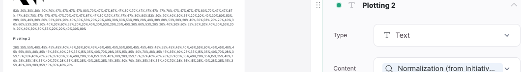
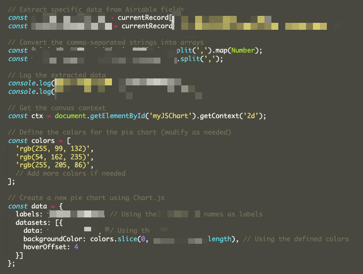
Instead, we added a few lookup fields to a single record in Airtable, allowing us to represent all of the data (100+ records) in a single chart via chartjs. It requires a little refinement, but its by far the most flexible way we’ve found to represent real-time data and represent as many datapoints as we want (or more specifically, as many datapoints that can fit inside of AIrtable’s Lookup fields.)
Here are some screenshots to share how we did this.
Detailed list block → looks at all of the lookup fields:
Custom code block grabs all of the data from the lookup fields that load on the softr page
The Chartjs code uses all of the data from the list details block and creates a chart out of it!