Hi,
Be careful with the use of .cssxxxx => this might be deprecated in the next weeks/months for buttons. Softr team is looking into having an easier way to find class selectors for buttons.
The correct code (well at least better to maintain) would be - Also It allows to have a design continuity as the buttons of the edit/add modals will be transformed too (example/demo here by clicking on add record).
To be inserted in the header of the “custom code” page settings
If you want the white border color from your code to appear, you need to activate the border in the softr studio first. So not very useful as it should be set up in the Studio, button settings, but here it is:
<style>
#listxx .MuiButtonBase-root{
background-color: #9796FC;
color: #FFFFFF;
border-radius: 14px;
border-color: #FFFFFF;
border-width: 2px; /*border must be set to "1" in the Softr studio first */
}
#listxx .MuiButtonBase-root:hover{
background-color: #D31FCA;
}
#listxx .MuiButtonBase-root:active{
transform: translateY(4px);
}
</style>
Note that if you want to keep a design parameter in :hover and :active, you don’t need to re-write it. Think of a cascade: everything that is written in the first part of the css code is kept within :hover and :active for the same selector. Unless you want to change it
I have a problem with the class id you gave “#listxx .MuiButtonBase-root”
This also affects the top bar button, and I want this design to only be on the item’s action buttons
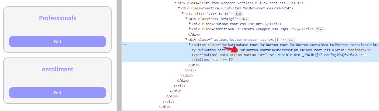
As .css-6oewgg is not a button (it’s the action buttons wrapper) it should be ok on a long term… Though I am not sure if .css-6oewgg would also be deprecated…
I use .actions-button-wrapper:nth-child(2) as the top bar button(s) are also inside an .action-button-wrapper.
nth-child() is useful to determine the first, second, third, etc. element of a same class. It allows you to not depend on certain arbitrary class names given by Softr.
Here it is made for #listxx but if you want to apply this to all of your list blocks of your page (+ maybe list details and table blocks but I didn’t check) just remove #listxx
 - Also It allows to have a design continuity as the buttons of the edit/add modals will be transformed too (