Hey guys,
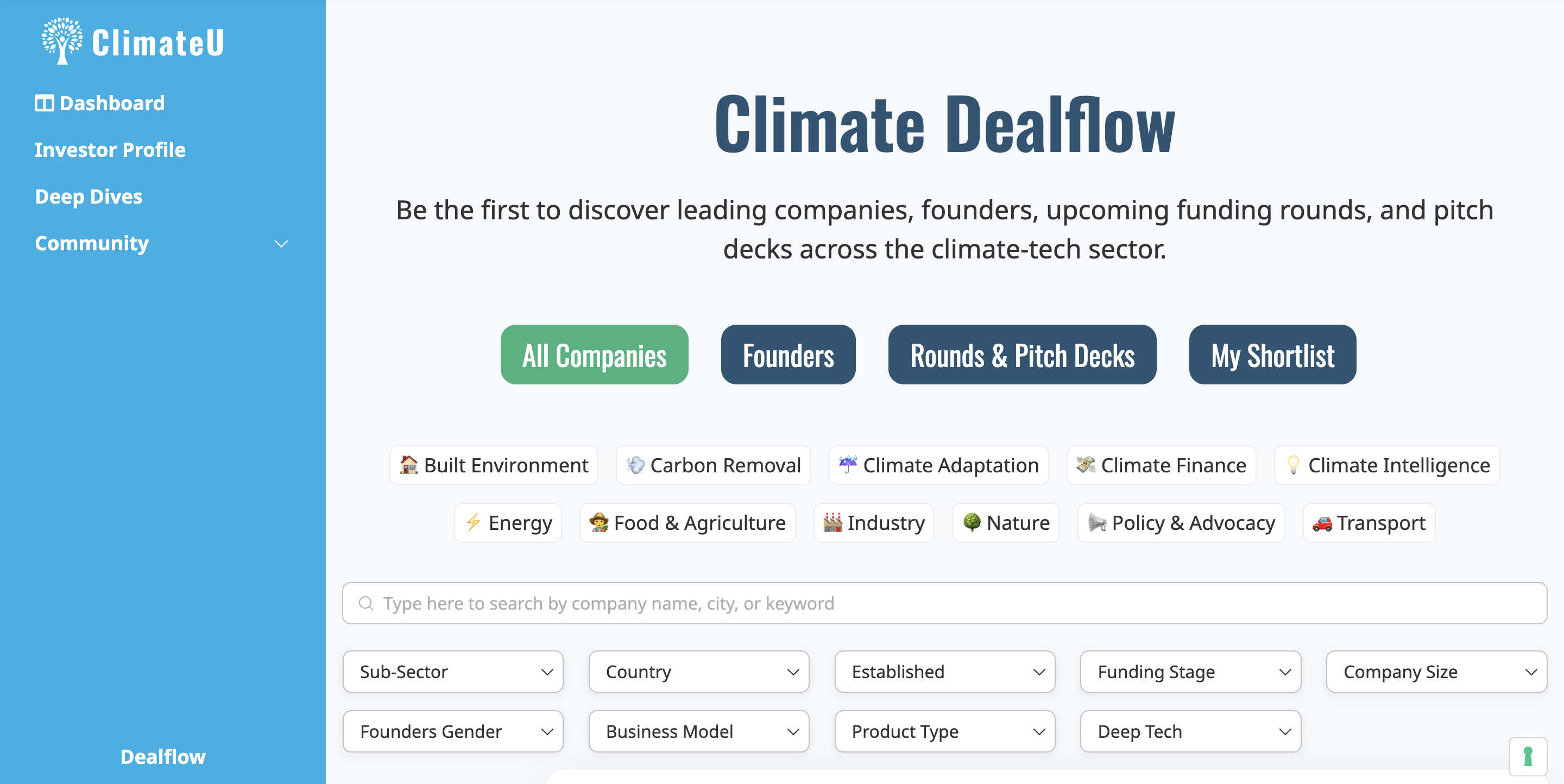
If I add a vertical header to my application, it makes everything REALLY tight on the screen, making the website feel very intense.
For instance, I can’t use any of the blocks where I added a container as it cuts into the container.
Is there a way to preserve the outline / “zoom out” a little on the pages?
Thanks so much in advance for any tips! 
2 Likes
Hi Tim,
One way would be to reduce the size of the vertical header width, what do you think? (doable)
Hey Matthieu,
I’ll try it for sure. I thought maybe there was also a way to shrink everything else 
Has the custom code for reducing the width already been posted somewhere? I couldn’t find it
Here it is:
To be inserted in the header custom code of the page (in a <style> </style> if you don’t have it yet)
Change header1 by the header Name/ID
Change the two 240px by whatever you want (but check how it looks first with this reduced width).
@media only screen and (min-width: 992px) {
#header1 {
    width:240px !important;
    margin-left: 0 !important;
}
.content[data-appid] > * {
  margin-left: 240px !important;
}
}
1 Like
Also if you want to shrink what’s to the right of the vertical header:
@media (min-width: 990px) {
    .container {
        width: 80%;
        margin: 0 auto;
    }
}
Be cautious with this one and test it carefully so that it doesn’t create a visual bug somewhere
1 Like
Amazing, testing it now. Thanks so much, Matthieu!!!
I encounter one problem here, I use headers based on user type, so if I add the code on app level, it will create a whitespace as a vertical header always, also for non-logged-in users.
Any idea for a workaround there?
What is the code you are talking about?
This one 
@media only screen and (min-width: 992px) {
#header1 {
    width:240px !important;
    margin-left: 0 !important;
}
.content[data-appid] > * {
  margin-left: 240px !important;
}
}
You would need to change #header1 by another blockId. Or to change the IDs of headers to match header1 in the code. Or to insert this code at page level (each page where you want this behaviour to happen).
If you have multiple headers the code you need is:
@media only screen and (min-width: 992px) {
#header1,
#header2,
#header3 { /* etc. */
    width:240px !important;
    margin-left: 0 !important;
}
.content[data-appid] > * {
  margin-left: 240px !important;
}
}
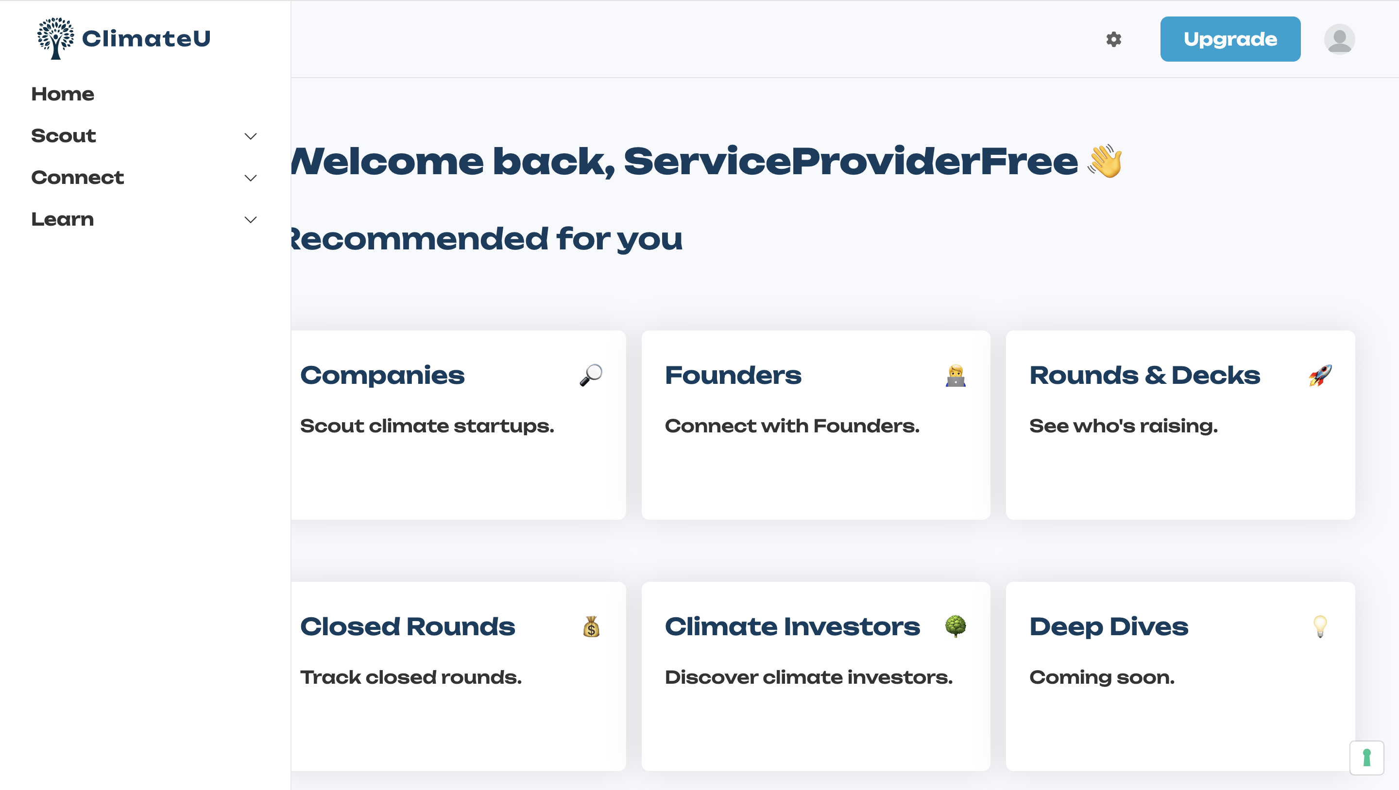
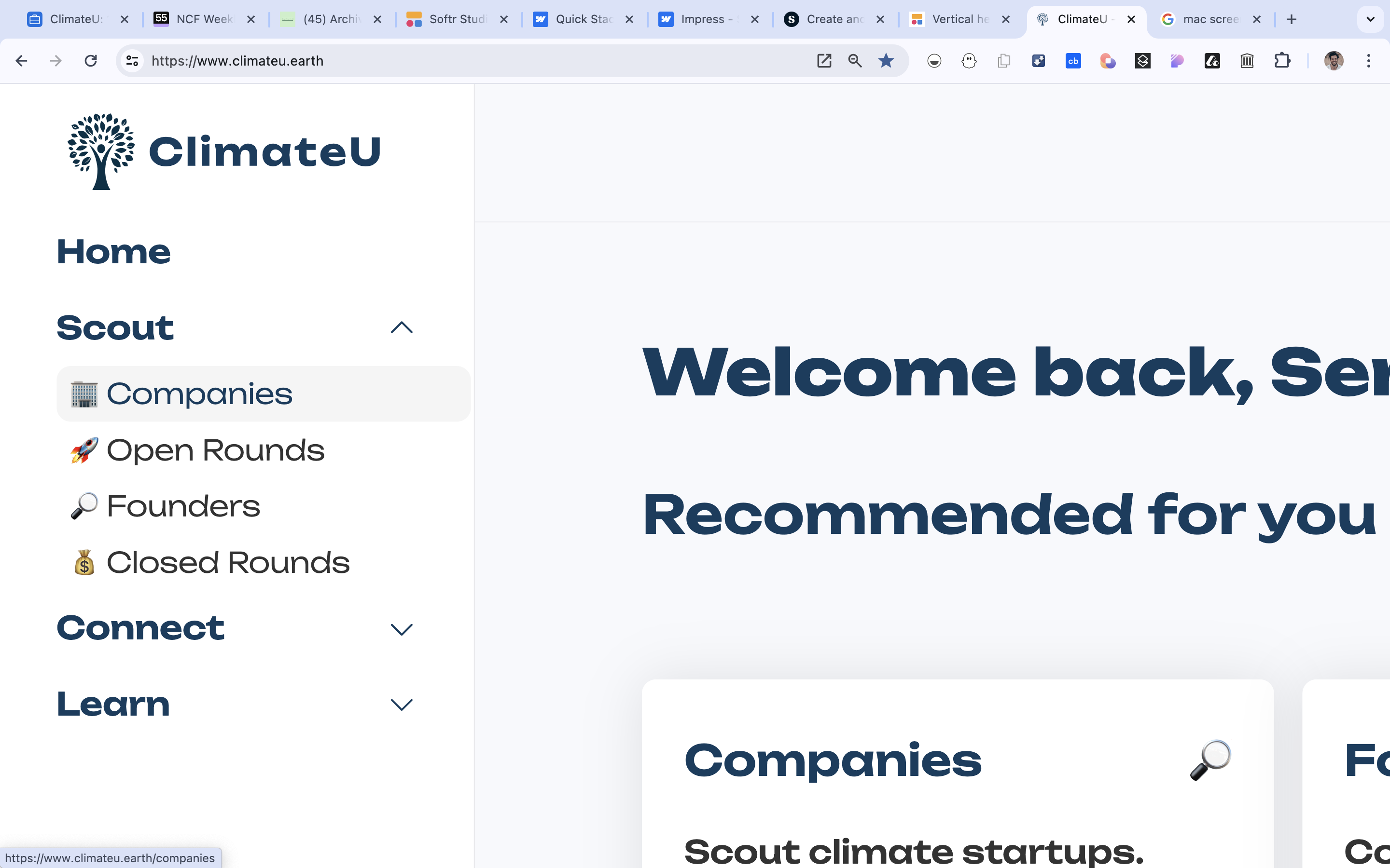
Hey @matthieu_chateau ,
I’m finally trying to make this work, but when I insert the code, this happens:
I have this code in the header of my app:
<style>
@media only screen and (min-width: 992px) {
#header-jobseekers,
#header-agencies,
#header-investors,
#header-corporates,
#header-companies,
#header-others { //etc.
    width:240px !important;
    margin-left: 0 !important;
}
.content[data-appid] > * {
  margin-left: 240px !important;
}
}
</style>```

Any idea why this might happen?
Can you remove the //etc. This was just an indication that there could be more and shouldn’t be added in the code (as a reference, this is not correct in terms of code grammar, it should be /* text indication*/ for css => I updated it)
If it is not working, impossible for me to debug unfortunately, it works fine on my end and the issue might come from a dozen of things like non updated blocks, other codes at app level or at page level.
1 Like
Now it works 
Thanks so much for looking into this @matthieu_chateau !
The only problem left, is that I only have a sidebar for logged-in users. Now, non-logged-in users would see a big white stripe on the side of the screen.
Do you think it’s straight-forward to somehow make the code conditional on the availability of a sidebar?
You would like to have this custom width for vertical headers to be only available for logged in users?
If so => you need to script =>
Replace all the code above by =>
<script>
window.addEventListener('DOMContentLoaded', (event) => {
    if (window.logged_in_user) {
        var style = document.createElement('style');
        style.innerHTML = `
            @media only screen and (min-width: 992px) {
                #header-jobseekers,
                #header-agencies,
                #header-investors,
                #header-corporates,
                #header-companies,
                #header-others {
                    width: 240px !important;
                    margin-left: 0 !important;
                }
                .content[data-appid] > * {
                    margin-left: 240px !important;
                }
            }
        `;
        document.head.appendChild(style);
    }
});
</script>
if (window.logged_in_user) { checks if the user is logged in or not
1 Like
This works perfectly!!
Thanks so much for all the help, Matthieu!!
Now I’m almost at the stage where I have a header that I’m happy with.
I’m just stuck with one more feature - I use:
#header-investors .MuiButtonBase-root:hover {
    background-color: #f5f5f5 !important;
    color: #123c5f !important;
    padding-right: 8px;
    padding-left: 8px;
    border-radius: 8px;
}
… to create a smooth(ish) hover effect on the navigation menu.
It now loks like this:
If I could tweak this in two more ways, it would look great:
-
If I could keep the hover for the page that is currently opened (there is an outdated version of this on Unlock Softr that doesn’t work unfortunately).
-
If I could somehow reduce the width of the hover shadow so that the new width of the sidebar does not cut so close to the shadow.
Do you think this is feasible, or have you seen other users put something like this together? I couldn’t find a solution in the forum.
I manage to solve problem #2 by simply adding:
" width: calc(100% - 8px);"
If somehow one could highlight the current page now via JS, that would make it look really sleek