Could anyone please help with a method to enable a user to view a chart in a certain way?
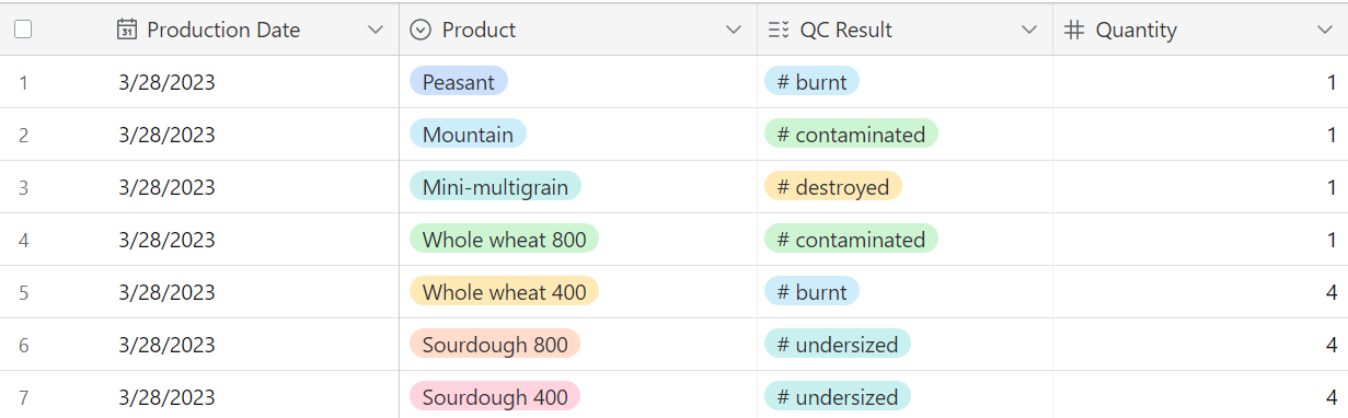
I would like to have a stacked bar graph with the product as the x variable and the bars segregated by the QC result with quantity as the value (y variable). I have attached a photo of the data organization in airtable. I would like the user to be able to choose the view of the graph based on the production date or be able to filter the results by the production date but the inline filter feature does not seem to exist in the chart block.
I am a softr beginner so I hope this question is not too ridiculous.
Any help is appreciated so much!
Thanks in advance
Definitely not a ridiculous question but I don’t think what you want to do is currently possible. The (manual) workaround would be to create a series of pages with different charts pre-setup based on the different visualizations and filters and then creating a navigation structure for users to switch between the different pages.
All that said, these are very good ideas for a improving the existing chart block. Softr just upgraded their chart blocks but I think they are continuing to work on more tweaks over the next several months to make them fully functional. Tagging @Suzie for the feature request!