Hi all,
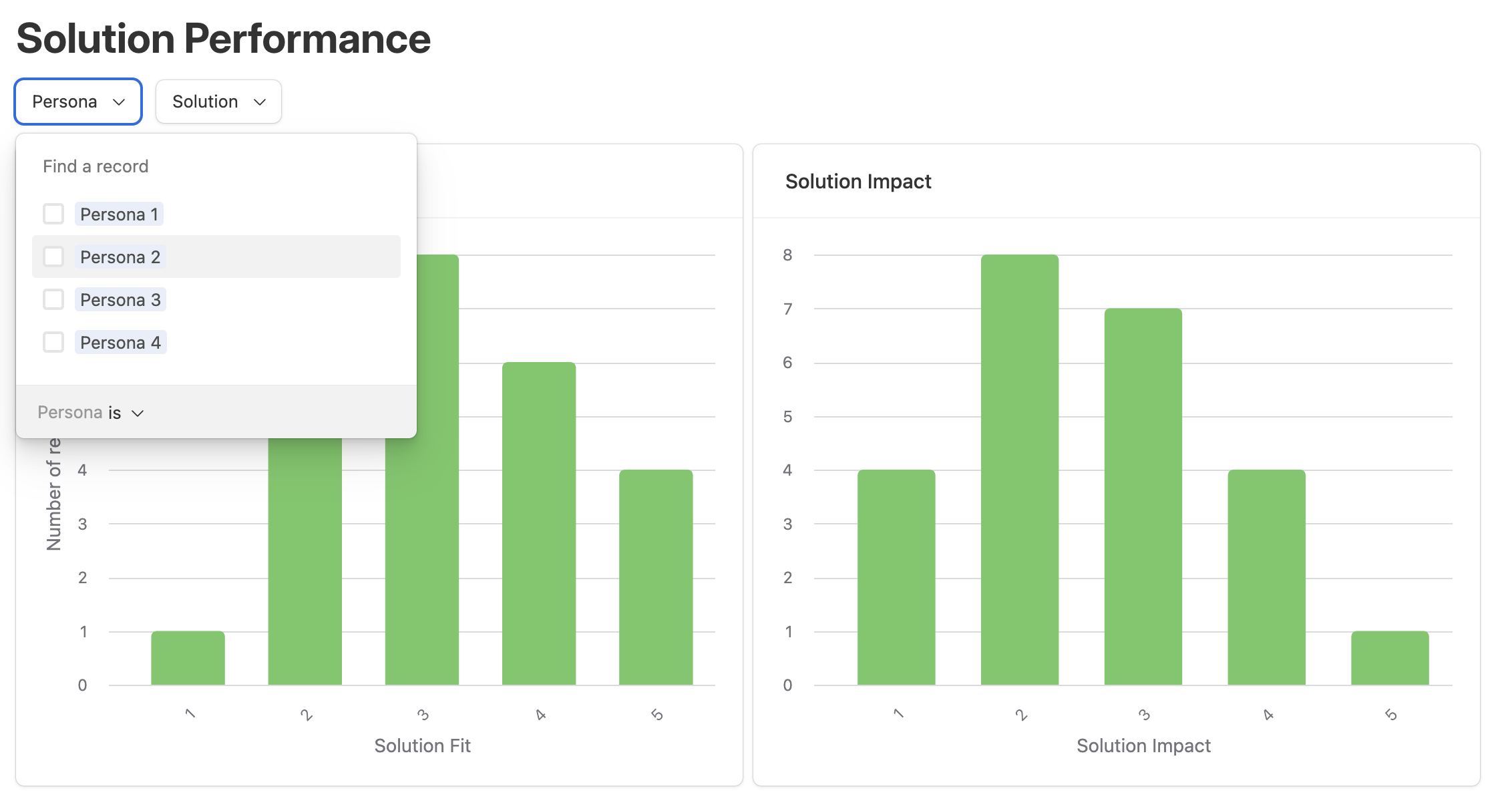
I am trying to replicate an Airtable graph in Softr. The most important feature in Airtable is that an enduser can filter the results displayed in a chart.
Random example: to display ice creams sold per day for an ice cream shop, I would want a user to filter for ice cream types and then see the graphs dynamically changing.
That’s possible in Airtable but I cannot find a similar option in Softr. Is this correct and if yes, is there a workaround?
Thanks in advance!
1 Like
Hi @no968145
Thanks for posting here! And welcome to our community ![]()
Unfortunately this is not a feature that our graphs have yet. Our team is currently doing some research on this topic though, and our hope is to make it possible in the future along with some more enhancements to our chart blocks.
If you have any feedback that you’d like to share with us for this kind of feature set, please feel free to do so!
Thanks for the quick reply.
A more general feedback - it seems that charts are still in its early development both visually and functionally. Hence I would remove it from your professional plan and move it into a lower tier. It was a major reason for me to sign up for the professional version but must say that the current state is quite underwhelming.
1 Like
Hi @no968145 thank you for sharing that feedback with us. While our graphs may be currently lacking the functionality you’re looking for, they’re still quite powerful!
However, I’ve shared this with our team, and will keep you updated if this featured is ever added in the future!
Hi, is there any update here on this feature?
1 Like
I’ve asked about the same thing in the past. It’s the obstacle that’s kept me from using Softr. Without it, I may need to create a user dashboard with dozens of graphs where 1 dynamic could otherwise suffice.
It’s not a small problem.
I’ll be on the sidelines until it’s worked out. I look forward to exploring Softr again when it is.
I see that “Chart Blocks Redesign” is ‘in progress’ on the current roadmap (Roadmap - Softr).
Will the chart block update include making charts dynamic by the use of user filters?
Sorry to hear this, @Mr.Matt
Hope to have you back soon! Unfortunately V5 of charts won’t come with this right away. We hope to get there soon though.
Thanks for the update
1 Like
I promise we recognize the value of this feature and are doing our best to get there as soon as possible! Will keep this thread updated as things progress.
1 Like
Any updates on this?
We’ve laid the data foundation to make this happen with Softr Databases + database synchronization. But we haven’t gotten to implementing this into graphs yet. No timeline to report at the moment, but we are continuing to make strides to make this a reality.