hello the softr’s team! ![]()
don’t you think that an improvement of the mobile experience could be made on the inline filter showed as dropdown?
The side scroll required to scroll through the records is not intuitive, could we not stack them?

hello the softr’s team! ![]()
don’t you think that an improvement of the mobile experience could be made on the inline filter showed as dropdown?
The side scroll required to scroll through the records is not intuitive, could we not stack them?

any idea to improve this? thank you softr ![]()
Let me discuss this in the team ![]() horizontal scrolling is common pattern but agree we have a room to improve.
horizontal scrolling is common pattern but agree we have a room to improve.
on mobile the scroll is easy, although it is difficult to see that the side scroll is possible in my opinion. on a computer (without trackpad) it is immediately more difficult.
I don’t know of a known site with a similar filter side-scroll experience, so I’m afraid it’s unnatural for users. thank you ++ @artur ![]()
We will be looking into it. We are going to boost the design of blocks soon. and most of those will be addressed. So I just need your patience here ![]()
Woow it promises ! ![]() do you have an estimate of the release date of the features ?
do you have an estimate of the release date of the features ?
Hi @lea!
You can actually set inline filters as dropdown if you wish:
RE: Horizontal scroll of tags – this is consider the best modern UX practice. Attaching a few examples from known sites.
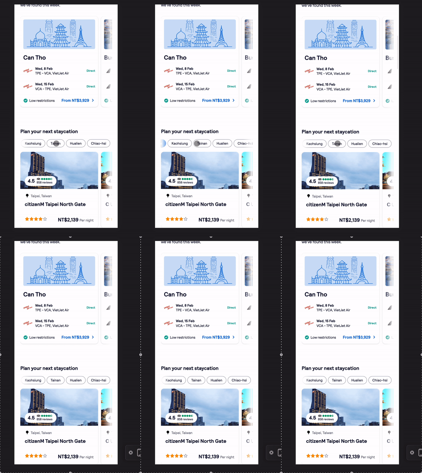
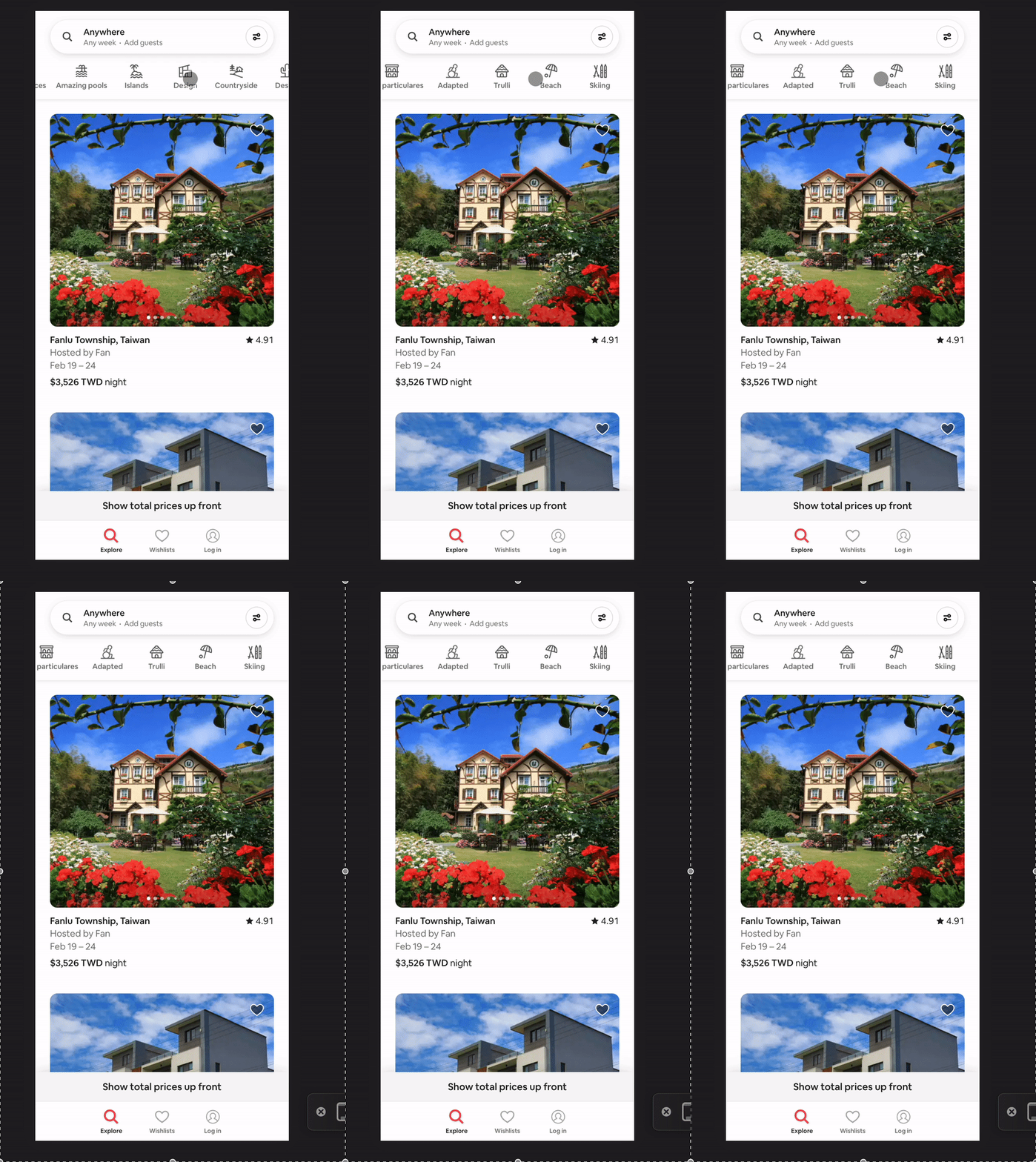
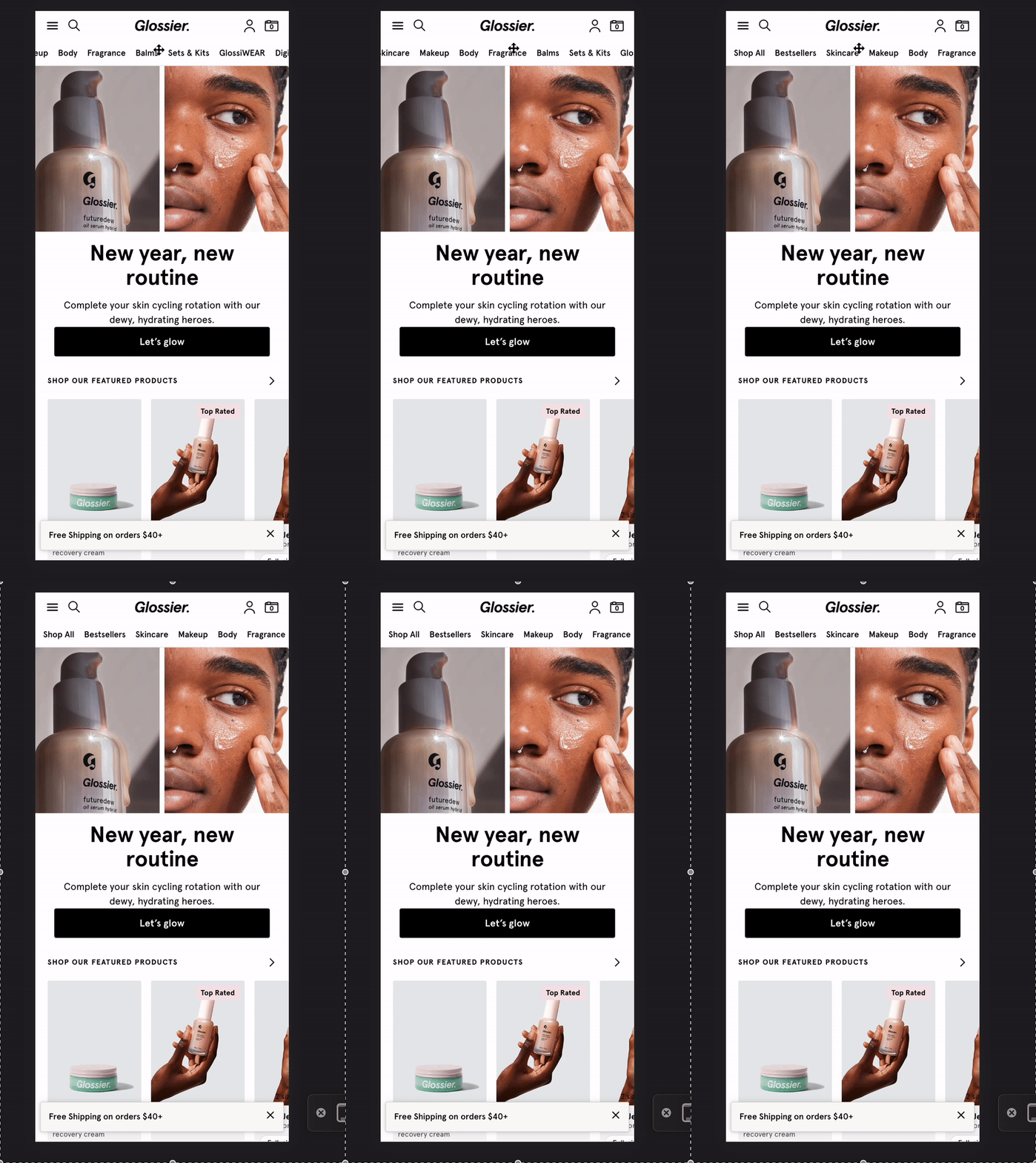
The issue with stacking is that when you have many options, the tags will take up quite a lot of page height before your users can even see the filtered items. (Now imagine if you have more than 1 filter ![]() )
)
But I can see it being useful when you only have a few options, so definitely will take into consideration. Could you share some examples that you’ve come across ![]() ?
?
Your examples are interesting but they are simple filters. In my case I have a sum of filters that lead to the display of the correct record for the user. ![]()
The side scroll is therefore a waste of time for him and since I only have a few options in my filters (but several filters per list) it’s really simpler for everything to be displayed. Maybe both options could be available in the studio? scroll lateral and all displayed
Compared to your examples, be careful, this is only a mobile display. For my part, the origin of the problem is the desktop display where the side scroll ux is rarely found ![]()
Thank you for your interest in this new ux, very excited to see it happen
@lea I’m a little confused. The horizontal scrolling behavior only exists on mobile and your screenshot is from a mobile site.
Do you see this behavior on desktop also?
Would also like to know if you have come across any site that has experience similar to what you’d like to create (a bit hard to visualize)?
@austinyang your point is true if you consider a mobile as a reduced screen width ![]()
In my case, I use an Inbox block to display an iframe displaying a List with vertical cards and description, you can view it under this link (a demo app) but here is a GIF showing the problem

@lea I see! Did you embed it using custom code? If so, perhaps you can try increase the width then it should be treated as tablet/desktop version.