Alright, based on popular demand, I am happy to introduce… 
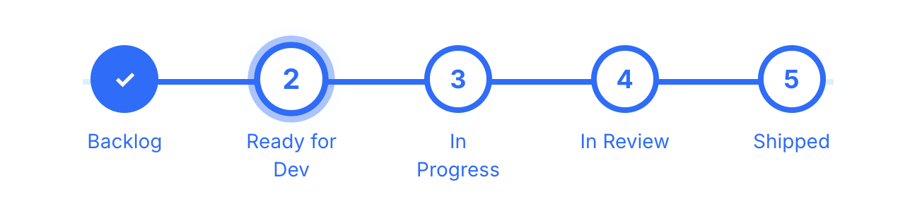
Progress Bar for Softr Details Pages!
Live Demo:
- Details page: Projects Details
- List page: Projects
How to Implement
Setup
- Add a Status field in Airtable (typically a dropdown)
- Create a field to store the “Status HTML”
Generating the HTML
- Method 1: Use a formula field (instant but long and complicated)
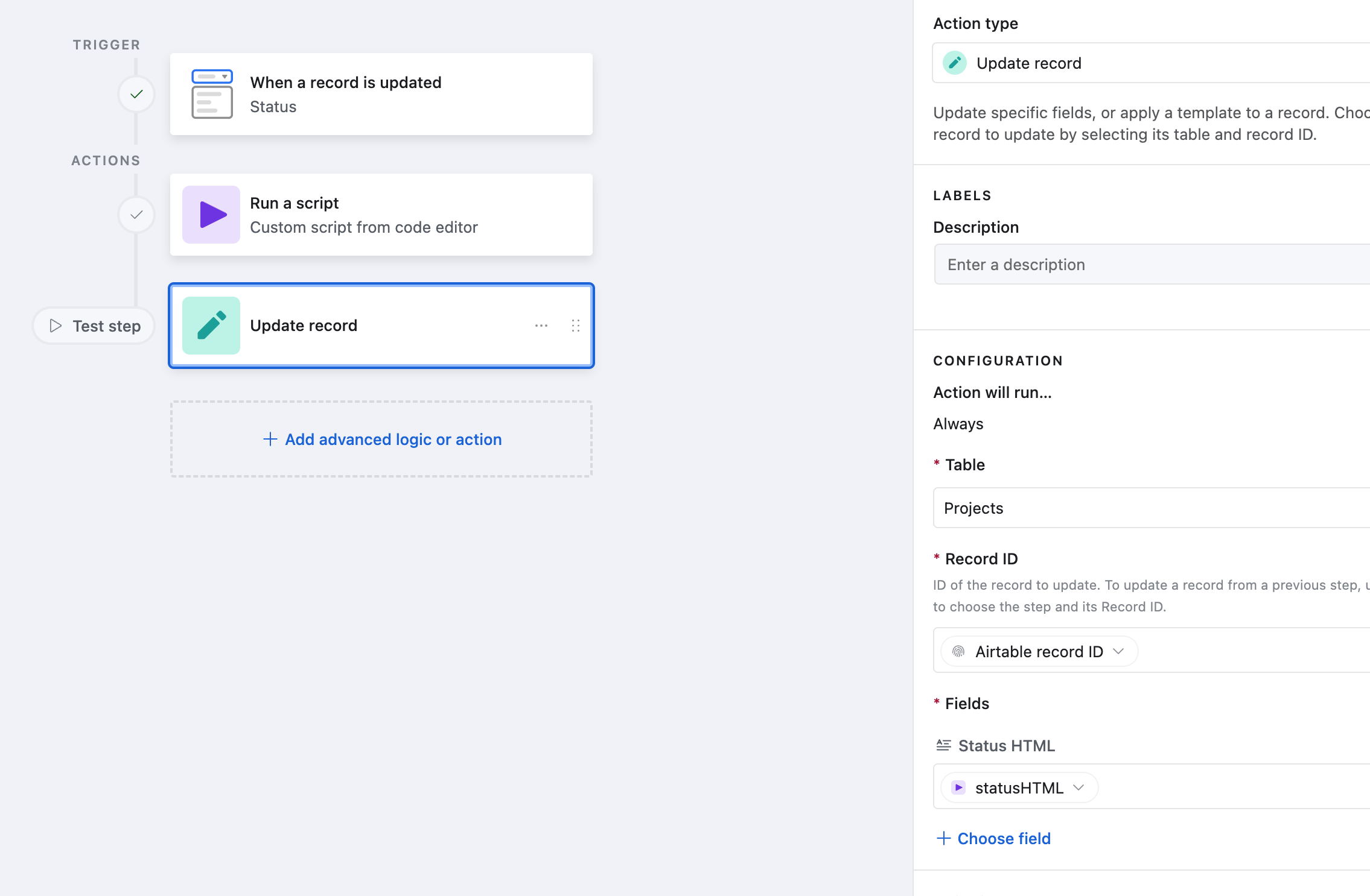
- Method 2: Use an automation that runs on status update (more control but slower for Airtable, instant in Xano)
Softr Setup
- On the details page, duplicate the item details block
- Delete everything, hide the media and add the Status HTML field as “Rich Text” to the first section so there is no label
- Add a custom code block to store the styling (CSS given below)
- Voila

Code
The code given below assumes a status bar with five statuses:
- Backlog
- Ready for Dev
- In Progress
- In Review
- Shipped.
Use AI to update for your use case.
Method 1 - Formula
"<div class='status-bar'>" &
"<div class='stage " &
IF({Status} = "Backlog", "active", IF(
OR({Status} = "Ready for Dev", {Status} = "In Progress", {Status} = "In Review", {Status} = "Shipped"), "completed", "todo")) &
"'><div class='circle'><span>" &
IF(OR({Status} = "Ready for Dev", {Status} = "In Progress", {Status} = "In Review", {Status} = "Shipped"), "✓", "1") &
"</span></div><div class='label'>Backlog</div></div>" &
"<div class='stage " &
IF({Status} = "Ready for Dev", "active", IF(
OR({Status} = "In Progress", {Status} = "In Review", {Status} = "Shipped"), "completed", "todo")) &
"'><div class='circle'><span>" &
IF(OR({Status} = "In Progress", {Status} = "In Review", {Status} = "Shipped"), "✓", "2") &
"</span></div><div class='label'>Ready for Dev</div></div>" &
"<div class='stage " &
IF({Status} = "In Progress", "active", IF(
OR({Status} = "In Review", {Status} = "Shipped"), "completed", "todo")) &
"'><div class='circle'><span>" &
IF(OR({Status} = "In Review", {Status} = "Shipped"), "✓", "3") &
"</span></div><div class='label'>In Progress</div></div>" &
"<div class='stage " &
IF({Status} = "In Review", "active", IF(
{Status} = "Shipped", "completed", "todo")) &
"'><div class='circle'><span>" &
IF({Status} = "Shipped", "✓", "4") &
"</span></div><div class='label'>In Review</div></div>" &
"<div class='stage " &
IF({Status} = "Shipped", "active", "todo") &
"'><div class='circle'><span>" &
IF({Status} = "Shipped", "5", "5") &
"</span></div><div class='label'>Shipped</div></div>" &
"</div>"
Method 2 - Automation
let { status } = input.config();
function generateStatusHTML(status) {
const trackerStages = [
'Backlog',
'Ready for Dev',
'In Progress',
'In Review',
'Shipped'
];
const currentIndex = trackerStages.indexOf(status);
function getStageClass(index) {
if (index < currentIndex) return 'completed';
if (index === currentIndex) return 'active';
return 'todo';
}
function getIconForClass(stageClass, index) {
return stageClass === 'completed' ? '✓' : index + 1;
}
let html = '<div class="status-bar">';
trackerStages.forEach((stage, index) => {
const stageClass = getStageClass(index);
const icon = getIconForClass(stageClass, index);
html += `
<div class="stage ${stageClass}">
<div class="circle"><span>${icon}</span></div>
<div class="label">${stage}</div>
</div>
`;
});
html += '</div>';
return html.replace(/\s{2,}|\n/g, '');
}
output.set('statusHTML', generateStatusHTML(status));
CSS (Add to Softr)
Make sure the ID on the first style matches the ID of the block where you want to render the Status Bar.
<style>
  #list-details1 section {
    justify-content: center;
  }

  .status-bar {
    display: flex;
    justify-content: space-around;
    align-items: center;
    max-width: 800px;
    margin: 0 auto;
    position: relative;
  }

  .status-bar::before {
    content: "";
    position: absolute;
    top: 24px;
    left: 5%;
    right: 5%;
    height: 4px;
    background-color: #e0f1ff; /* Light blue to complement primary */
    z-index: 0;
  }

  .stage {
    text-align: center;
    position: relative;
    z-index: 1;
    width: 100%;
  }

  .stage:not(:last-child)::after {
    content: "";
    position: absolute;
    top: 24px;
    left: 50%;
    width: 100%;
    height: 4px;
    background: #3278FF; /* Solid primary color line */
    z-index: -1;
  }

  .circle {
    width: 48px;
    height: 48px;
    border: 4px solid #3278FF; /* Primary Blue */
    border-radius: 50%;
    display: flex;
    justify-content: center;
    align-items: center;
    font-weight: bold;
    font-size: 18px;
    color: #fff;
    background-color: #3278FF; /* Primary Blue */
    margin: 0 auto 10px;
  }

  .completed .circle {
    background-color: #3278FF;
    color: #fff;
  }

  .todo .circle {
    background-color: #fff;
    color: #3278FF;
    border: 4px solid #3278FF;
  }

  .active .circle {
    background-color: #fff;
    color: #3278FF;
    border: 4px solid #3278FF;
    outline: 4px solid rgba(50, 120, 255, 0.4); /* Soft glow */
    animation: pulse 1s infinite cubic-bezier(0.25, 0.1, 0.25, 1) 3s;
  }

  .label {
    font-size: 14px;
    color: #3278FF;
    padding: 0 25px;
    height: 15px;
  }

  @keyframes pulse {
    0% {
      transform: scale(1);
      box-shadow: 0 0 0 0 rgba(50, 120, 255, 0.6);
    }
    70% {
      transform: scale(1.1);
      box-shadow: 0 0 0 10px rgba(50, 120, 255, 0);
    }
    100% {
      transform: scale(1);
      box-shadow: 0 0 0 0 rgba(50, 120, 255, 0);
    }
  }

  @media (max-width: 600px) {
    .status-bar {
      gap: 6px;
    }

    .circle {
      width: 28px;
      height: 28px;
      font-size: 12px;
      margin-bottom: 2px;
    }

    .label {
      display: none;
    }

    .stage {
      min-width: 40px;
    }

    .status-bar::before,
    .stage:not(:last-child)::after {
      height: 2px;
      top: 14px;
    }
  }
</style>
That’s it! Hope it’s useful!