Hi all,
the block option ‘feature grid with steps’ does not show up properly in the ‘tablet-view’ for me - anyone else having this problem?
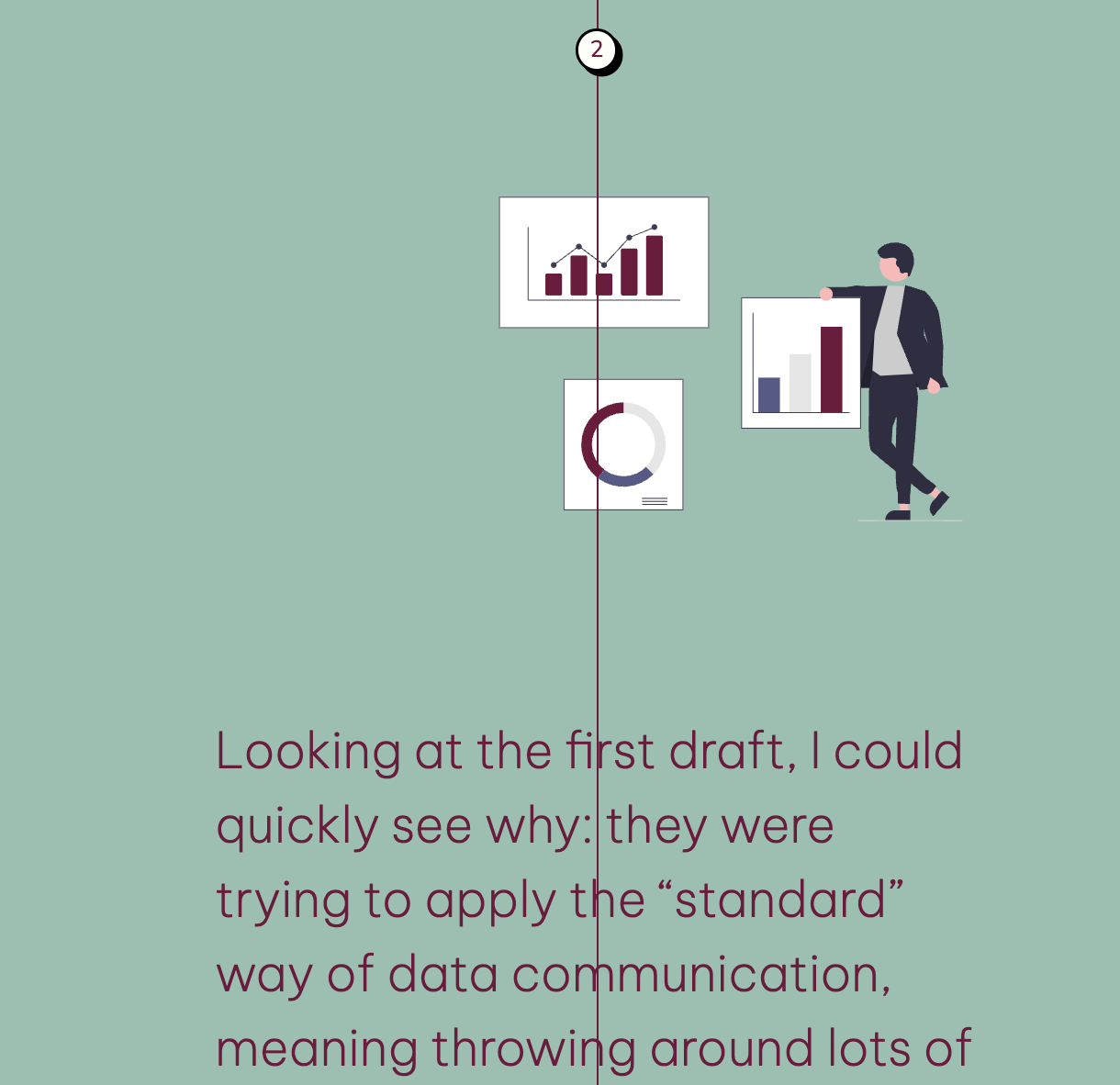
It’s like as if the pre-written CSS is messed up:
the steps line is in the middle but the text and picture do not align to either side (2 columns) but instead are all in one column like for mobile view.
Any ideas here or could this be rectified in the system?
Thanks
Claudia
Hey @ckoerner!
Thanks a lot for reaching out, can you please let us know what kind of tablet are you using?
Also can you please make sure there aren’t any styling codes that are interfering with the layout?
Best,
Hi, not using a tablet - this is Softr’s preview. I only manipulated the colour of the line. When i rename the block so the css does not trigger - the problem still persists.
Hey @ckoerner !
Can you please add support@softr.io as a collaborator to this app and point us to the affected page?
Best,
Hey Andranik
Softr is already supporting. This feature is on the ‘About’ page of the app.
I tried to rebuild this section to make it look better for mobile view anyway using ‘Feature Grid with images’ but also does not fold to a nice look on tablet size. It funnily stays in a 3column form in stead of defaulting to 2 or even just 1 column.
Is there another type of building block you would suggest?
Hey @ckoerner!
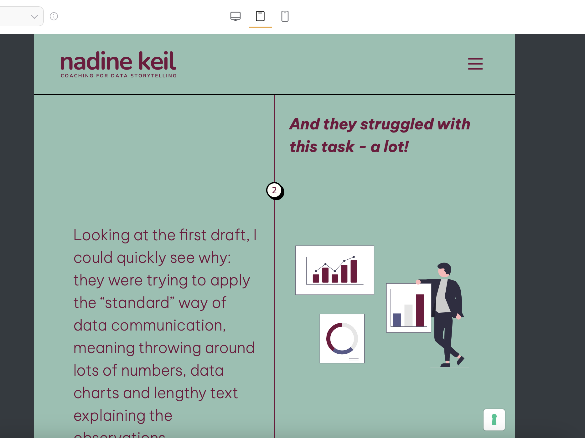
This is what it looked like on your studio tablet view
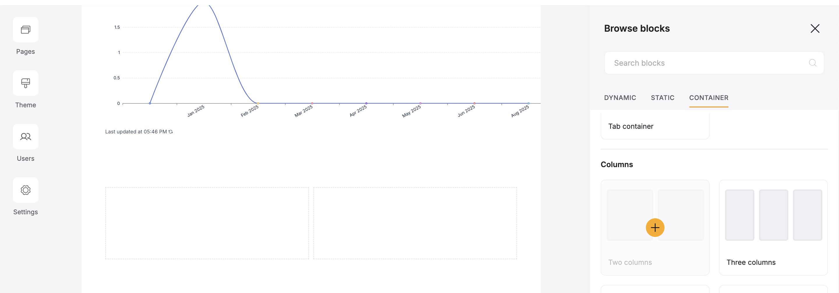
You can go with the container (2 columns) layout to have the 2 columns view on tablet.