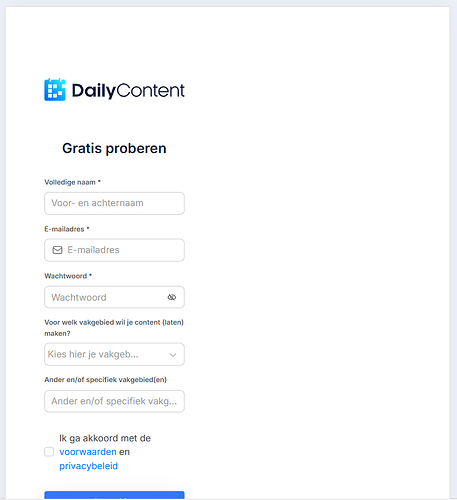
When I use a sign up block [sign up with side image] the responsiveness works fine on viewports:
- desktop: sign up form left and image right
- mobile: sign up form centered and no image shown
However, on tablet portrait viewport the reponsive behavior is off:
the sign up form is left aligned with big whitespace block on the right
See screenshot below. I think the UX would be better if the form was centered.
Or do I miss a setting somewhere to optimize this?
