Currently when you make a list with vertical cards and tag filtering, there’s a few responsive issues:
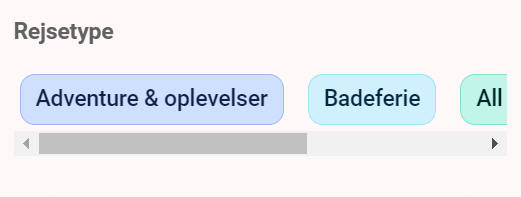
When using inline filtering with 4 or more tags, the tag options turn into a slider. Is it possible to keep the tags in the mobile screen somehow, instead of it becoming a slider? I know I can use the dropdown menu, but that’s not what I’m looking for (See attached image)
On tablet, with 3 or more cards displaying in the same list, the cards become elongated and looks weird. Is it possible to display 1 or 2 cards instead of cramming 3 cards into the tablet display? And if it isnt, can we customize the text size for tablets only with code? (See attached image)
this is how our app is currently working as mobile screens are small-sized and we need to fit all the tags in the screen. But, I will add your message as a suggestion to make it possible to display the tags without a slider too.
Nope, it is not possible to make 1 or 2 carts visible per page on tablets. But, if you let me know which field setting you are referring to about changing the text size, I will help you change it.
I’ve had similar requests from my users. Back in like October/November, I was building a page that required A LOT of tags (for a large org with ~40 locations, wanted the icons for quick filtering vs using drop down). My old workaround on desktop to avoid a scroll was to create 3-4 identical filters and only add the # of location tags that would fit on one line.
Softr updated that feature so I could add all tags and just have it automatically stack/arrange those without a scroll bar on desktop so now I only have 1 fiter setting If we could configure mobile to treat the tags in the same way (stack em, dont scroll em!) I think that would be a great improvement!
Having to scroll the page up/down to select the right tag is still less cumbersome than scrolling on the bar left-right on mobile, and in certain cases I think users prefer that view as opposed to scrolling tags in the list (vs bubbles) Sorry my UI vocab is lacking, clearly haha. Hopefully what I’m trying to explain makes sense
I’d like to second @Jondekh request to colour code dropdown tags/options! One of the things I like about Softr is the way multicoloured tags can be used as filters when displaying records.
In my case, I am sharing a lot of different types of application so there are a lot of tags to choose from. It creates a pleasing burst of colour on the pages. However when browsing the site using mobile the filters become overwhelming and the benefit is lost as the experience deteriorates for the viewer.
To make the site flow better on mobile I have chosen to use a dropdown filter and have found the text is in light grey against a white background. Ideally I’d like to match the tag colours to my data source but if that isn’t possible then being able to define a different colour to grey would make it more legible.
I’m happy to demonstrate what I mean if my explanation isn’t clear!
I guess this could be posted in Feature Requests but thought I should link it to other’s previous requests too.

 If we could configure mobile to treat the tags in the same way (stack em, dont scroll em!) I think that would be a great improvement!