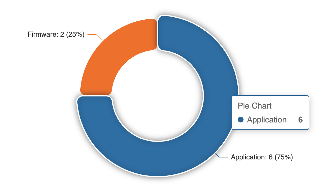
The pie charts, along with donut and rose, always display “Pie Chart” as the tooltip title.
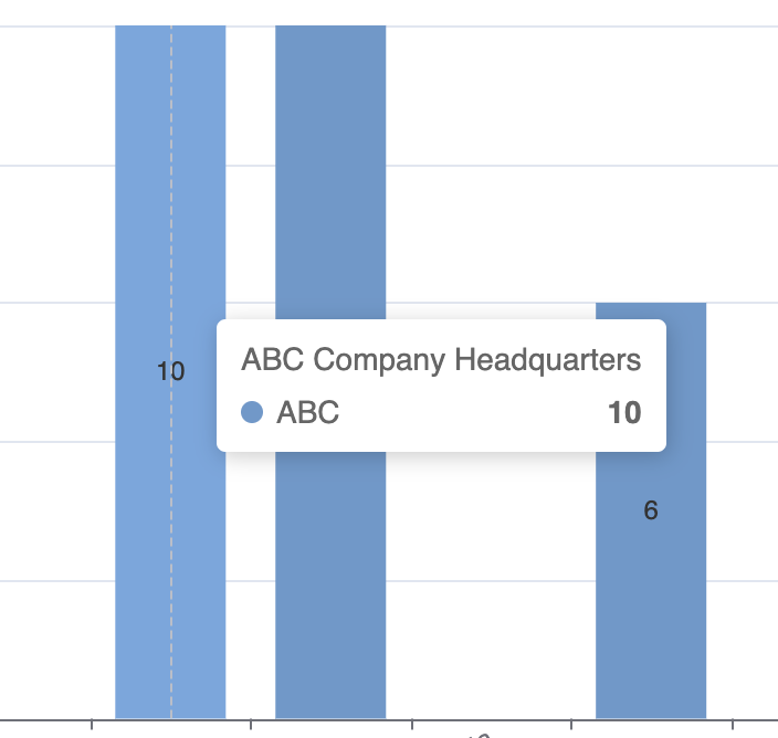
When you use bar or line charts, the tooltip displays the actual category name:
It would be great if the pie charts used the same tooltip logic as the bar charts. We’ve created a dashboard style page in our app and hovering over a chart should show the categories and values. The wording “Pie Chart” has been throwing users off.
Hi @nocodeking, thank you very much for the note. We will check it and fix it in one of our next chart block updates. Sorry for the inconvenience!
Hi, I wanted to ask if there was any update on this or if you managed to customize it somehow?
Also, is it possible to display the “total” at the bottom of the chart? I have these Donut’s and it would be great to display at the bottom of them the total sum of the items they’re counting.
No update on this yet and I have not found a way to fix it with code.