I’m using the “header with sublinks, icons and description” block. This happens on both tablets and mobile.
When you tap on the hamburger icon on the header, it expands it so that you can look at the menus and tap on them (opening and closing the individual menus works fine), but there doesn’t appear to be any way of closing the header itself again, which means the user cannot browse the page they’re currently on.

The hamburger icon in the corner at the top of the header…
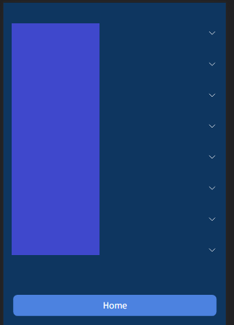
Which isn’t there once you open it (names of menus covered up, but they’re displayed properly.)
I do not have any custom code on the page I’m testing it on, and nothing site-wide that affects the header specifically.