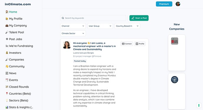
I created a really nice feed with the “New Companies” shown on the right, but today, some updates seem to have killed the layout, and now it looks very odd.
Was there some update and something wasn’t thought through that impacts the layout? (Picture below)
Thanks in advance!
Update: I recreated the container and form, and now it seems to be back to normal. Not sure why this happened.
I sometimes have these detail blocks suddenly change from Stacked to Columns. It might have been that.
Hi. What block do you use to get the left hand menu options like that please?
Just a vertical header. Just add the header and then change it to vertical in the settings 
1 Like
