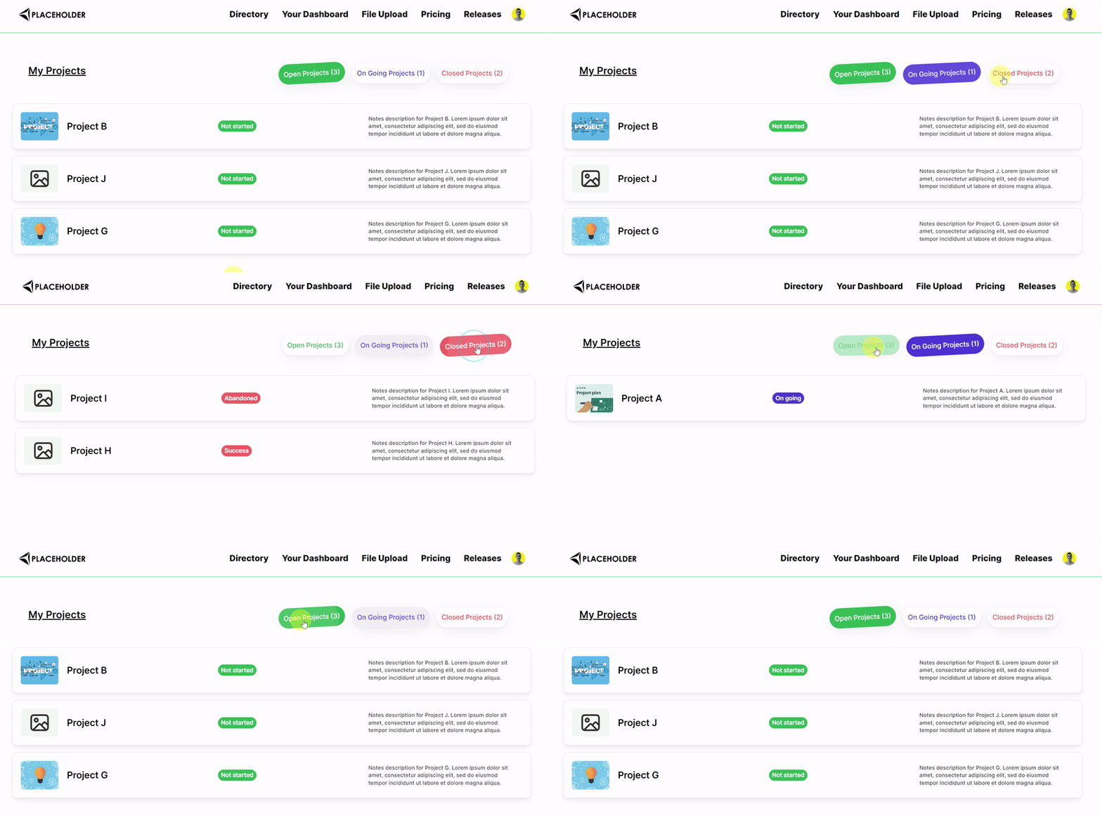
Update: display the number of items for each tab.
Demo here:

There are three tabs. Tab 1 for the number of open projects. Tab 2 for the number of on going projects. Tab 3 for the number of closed projects
How to
1) Airtable Setup
Everything should happen inside the users table of your Airtable base.
In my example I want to display the number of open projects, on going projects and closed projects of the logged in user.
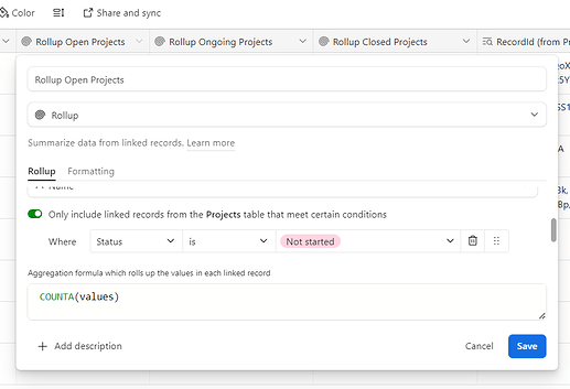
So in the users table I created three rollup fields counting the number of projects linked to the user each time by filterting with the correct status. The formula of the rollup field is COUNTA(values)
An example below for open Projects
The field to count the open projects is called “Rollup Open Projects”
The field to count the open projects is called “Rollup Ongoing Projects”
The field to count the open projects is called “Rollup Closed Projects”
=> this is important for what’s following
2) Go to Softr studio
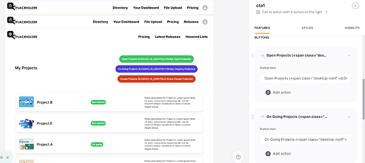
Add a cta block with 3 buttons.
These 3 buttons should have no action setup!
Now what should be inserted in the label of these buttons?
-
Text in the first button will be:
Open Projects (<span>{LOGGED_IN_USER:FIELD:Rollup Open Projects}</span>) -
Text in the first button will be:
On Going Projects (<span>{LOGGED_IN_USER:FIELD:Rollup Ongoing Projects}</span>) -
Text in the first button will be:
Closed Projects (<span>{LOGGED_IN_USER:FIELD:Rollup Closed Projects}</span>)
Every text after FIELD: is the actual Airtable field you want to point to (case sensitive!)
Then go to the header custom code of the page
Add this code (explanation below):
<style>
#cta1 a[data-element="button"]:nth-child(1) {
  background-color: #FFFFFF !important;
  color: #228B22 !important;
  transition: all 0.3s ease;
}

#cta1 a[data-element="button"].active:nth-child(1),
#cta1 a[data-element="button"]:nth-child(1):hover,
#cta1 a[data-element="button"].active:nth-child(1):hover {
  background-color: #228B22 !important;
  color: #fff !important;
  transform: rotate(-3deg);
  transition: all 0.3s ease;
}

#cta1 a[data-element="button"]:nth-child(2) {
  background-color: #FFFFFF !important;
  color: #4D3DD8 !important;
  transition: all 0.3s ease;
}

#cta1 a[data-element="button"].active:nth-child(2),
#cta1 a[data-element="button"]:nth-child(2):hover,
#cta1 a[data-element="button"].active:nth-child(2):hover {
  background-color: #4D3DD8 !important;
  color: #fff !important;
  transform: rotate(-3deg);
  transition: all 0.3s ease;
}

#cta1 a[data-element="button"]:nth-child(3) {
  background-color: #FFFFFF !important;
  color: #F36364 !important;
  transition: all 0.3s ease;
}

#cta1 a[data-element="button"].active:nth-child(3),
#cta1 a[data-element="button"]:nth-child(3):hover,
#cta1 a[data-element="button"].active:nth-child(3):hover {
  background-color: #F36364 !important;
  color: #fff !important;
  transform: rotate(-3deg);
  transition: all 0.3s ease;
}

</style>


<script>
window.addEventListener('block-loaded-cta1', () => {
    if (window['logged_in_user']) {
        const user = window['logged_in_user'];

        const openProjectsData = user['Rollup Open Projects'];
        const ongoingProjectsData = user['Rollup Ongoing Projects'];
        const closedProjectsData = user['Rollup Closed Projects'];

        if (typeof openProjectsData !== 'undefined' && (openProjectsData || openProjectsData === 0)) {
            console.log('CTA1 loaded: Open Projects');
            $("#cta1 a:nth-child(1) span.MuiBox-root span").html(String(openProjectsData));
        }

        if (typeof ongoingProjectsData !== 'undefined' && (ongoingProjectsData || ongoingProjectsData === 0)) {
            console.log('CTA1 loaded: Ongoing Projects');
            $("#cta1 a:nth-child(2) span.MuiBox-root span").html(String(ongoingProjectsData));
        }

        if (typeof closedProjectsData !== 'undefined' && (closedProjectsData || closedProjectsData === 0)) {
            console.log('CTA1 loaded: Closed Projects');
            $("#cta1 a:nth-child(3) span.MuiBox-root span").html(String(closedProjectsData));
        }
    }
});
</script>


<script>
 window.addEventListener('DOMContentLoaded', (event) => {
  document.getElementById("list1").style.display = "block";
  document.getElementById("list2").style.display = "none";
  document.getElementById("list3").style.display = "none";
});
window.addEventListener('block-loaded-cta1', () => {
    console.log('CTA block loaded');
    document.querySelector('#cta1 a[data-element="button"]:nth-child(1)').classList.add('active');
});

window.addEventListener('block-loaded-cta1', () => {
  console.log('CTA Block loaded');

  const buttonClickHandler = (e) => {
    const button = e.target.closest('#cta1 a[data-element="button"]');
    if (button) {
      e.preventDefault();
      const activeButton = document.querySelector('#cta1 a[data-element="button"].active');
      if (button !== activeButton) {
        activeButton.classList.remove('active');
        button.classList.add('active');
        const buttonIndex = Array.from(button.parentNode.children).indexOf(button) + 1;
        if (buttonIndex === 1) {
          document.getElementById("list1").style.display = "block";
          document.getElementById("list2").style.display = "none";
          document.getElementById("list3").style.display = "none";
        } else if (buttonIndex === 2) {
          document.getElementById("list2").style.display = "block";
          document.getElementById("list1").style.display = "none";
          document.getElementById("list3").style.display = "none";
        } else if (buttonIndex === 3) {
          document.getElementById("list3").style.display = "block";
          document.getElementById("list1").style.display = "none";
          document.getElementById("list2").style.display = "none";
        }
      }
    }
  };

  document.body.addEventListener('click', buttonClickHandler);
});
</script>
Code Explanation
- The style part
For those used to my codes => I added a style effect… Obviously very superfluous but still very cool. If you want to remove it, just removetransform: rotate(-3deg);andtransition: all 0.3s ease;everywhere you find it. You can find more effects in this guide I made: Custom Code Guide for hover effects for list blocks
The rest is classic for the tab feature styles.
- The first script
const openProjectsData/const ongoingProjectsData/const closedProjectsData
You can see that these are followed by the exact name of the Airtable field. It needs to be the exact name - case sensitive.
#cta1 a:nth-child(1) span.MuiBox-root span is the selector of the span tag inside the text of the button. It might be different if you use another cta block.
- The last script
Classic for the tab feature.
You understand that list1 is the block I use to display the open projects of the logged in user
list2 is the block I use to display the ongoing projects of the logged in user
list3 is the block I use to display the closed projects of the logged in user
Obviously, each of the lists are filtered to only show the open projects/ongoing projects/closed projects and to only show the logged in user’s data.

