Guide for Softr Tabs Customization

Hi all,

For those who want a glimpse of what’s possible with customizing the Softr tab container=>

How to do this?

All css codes to be inserted in the header of the page settings.

Tab Design 1
<style>
#tab-container5 [role="tablist"] {
    border-bottom: 0px solid #FFFFFF !important;
}

#tab-container5 .tab-list button:not([title="Prev"]):not([title="Next"]) {
    background-color: #ffffff !important;
    color: #000000 !important;
    border: none;
    padding: 10px 20px;
    cursor: pointer;
    font-size: 16px;
    font-family: Arial, sans-serif;
    outline: none;
    transition: background-color 0.3s;
    border-radius: 15px 15px 0 0 / 15px 15px 15px 15px;
}

#tab-container5 .tab-list button:hover:not([title="Prev"]):not([title="Next"]),
#tab-container5 .tab-list button:active:not([title="Prev"]):not([title="Next"]),
#tab-container5 .tab-list button[data-state="active"]:not([title="Prev"]):not([title="Next"]),
#tab-container5 .tab-list button[data-state="active"]:hover:not([title="Prev"]):not([title="Next"]) {
    background-color: #F2F2F2 !important;
    border: none !important;
    border-radius: 15px 15px 0 0 / 15px 15px 15px 15px;
}
</style>

Tab Design 2 (same as design 1 but squared borders)
<style>
#tab-container4 [role="tablist"] {
    border-bottom: 0px solid #FFFFFF !important;
}

#tab-container4 .tab-list button:not([title="Prev"]):not([title="Next"]) {
    background-color: #ffffff !important;
    color: #000000 !important;
    border: none;
    padding: 10px 20px;
    cursor: pointer;
    font-size: 16px;
    font-family: Arial, sans-serif;
    outline: none;
    transition: background-color 0.3s;
}

#tab-container4 .tab-list button:hover:not([title="Prev"]):not([title="Next"]),
#tab-container4 .tab-list button:active:not([title="Prev"]):not([title="Next"]),
#tab-container4 .tab-list button[data-state="active"]:not([title="Prev"]):not([title="Next"]),
#tab-container4 .tab-list button[data-state="active"]:hover:not([title="Prev"]):not([title="Next"]) {
    background-color: #F4F2EE !important;
    border: none !important;
}
</style>

Tab Design 3
<style>
#tab-container3 .tab-list button {
    transition: font-size ease 0.2s !important;
}

#tab-container3 .tab-list button:hover {
    font-size: 16px !important;
}

#tab-container3 .tab-list button[data-state="active"] {
    font-size: 16px !important;
}
</style>

Tab Design 4
<style>
#tab-container2 .tab-list {
    display: flex !important;
    justify-content: center !important;
}
</style>

Tab Design 5
<style>
#tab-container1 .tab-list button:hover,
#tab-container1 .tab-list button[data-state="active"] {
    border-bottom: 2px solid #4a9ecd !important;
    color: #4a9ecd !important;
}
</style>

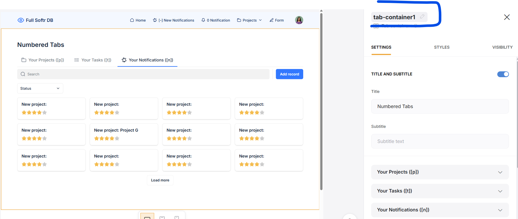
Note that if you have a lot of tabs or if you are on mobile, you will need to use the :not pseudo-class so that the left and right arrows (Prev/Next) appear for tab navigation.
By using the :not pseudo class I exclude these two arrows from the css rules I wrote.
You can see it in the codes of Tab Design 1 and Tab Design 2 (the use of :not is specific to these two tab containers as the written css rules apply to the whole button… While the left and right arrows are also inside a button element)

*updated

5 Likes

thanks, super helpful!

1 Like

Hi!
Thank you very much for the code. Again, it is something I was looking for and needed. One question: When I smell the code and on an ab sheet there is also an abel with action buttons, the action buttons are also affected by the code. How can I prevent this?

Hi Jacques,

What code do you use exactly?

<style>
#tab-container1 [role="tablist"] {
    border-bottom: 0px solid #FFFFFF !important;
}

#tab-container1 button:not([title="Prev"]):not([title="Next"]) {
    background-color: #ffffff !important;
    color: #000000 !important;
    border: none;
    padding: 10px 20px;
    cursor: pointer;
    font-size: 16px;
    font-family: Arial, sans-serif;
    outline: none;
    transition: background-color 0.3s;
    border-radius: 15px 15px 0 0 / 15px 15px 15px 15px;
}

#tab-container1 button:hover:not([title="Prev"]):not([title="Next"]),
#tab-container1 button:active:not([title="Prev"]):not([title="Next"]),
#tab-container1 button[data-state="active"]:not([title="Prev"]):not([title="Next"]),
#tab-container1 button[data-state="active"]:hover:not([title="Prev"]):not([title="Next"]) {
    background-color: #F2F2F2 !important;
    border: none !important;
    border-radius: 15px 15px 0 0 / 15px 15px 15px 15px;
}
</style>

Can you test this:

<style>
#tab-container1 .tab-list {
    border-bottom: 0px solid #FFFFFF !important;
}

#tab-container1 .tab-list button:not([title="Prev"]):not([title="Next"]) {
    background-color: #ffffff !important;
    color: #000000 !important;
    border: none;
    padding: 10px 20px;
    cursor: pointer;
    font-size: 16px;
    font-family: Arial, sans-serif;
    outline: none;
    transition: background-color 0.3s;
    border-radius: 15px 15px 0 0 / 15px 15px 15px 15px;
}

#tab-container1 .tab-list button:hover:not([title="Prev"]):not([title="Next"]),
#tab-container1 .tab-list button:active:not([title="Prev"]):not([title="Next"]),
#tab-container1 .tab-list button[data-state="active"]:not([title="Prev"]):not([title="Next"]),
#tab-container1 .tab-list button[data-state="active"]:hover:not([title="Prev"]):not([title="Next"]) {
    background-color: #F2F2F2 !important;
    border: none !important;
    border-radius: 15px 15px 0 0 / 15px 15px 15px 15px;
}
</style>

Update: tab-container1 .tab-list button is the stable selector to be used.

2 Likes


Hi. Thanks! But:… That doesn’t work Look at the image

It does work, tested.

What is the exact code you have for this page?

1 Like

Hi! It works now. Maybe it was the cach of the browser… Thanks!!!

1 Like

Thanks Mat!

I have a question for you:
If I have an ADD form with 3 steps. I would like to place every step in a different tab. How do I manage the submit or save button?

I would like to use the tab container instead of the multi-step form.

Thanks

Hi Gabriel,

Unfortunately this is impossible to do this. Too much limitations regarding the tab and forms flexibility.
Custom code can do a lot in Softr, but this: clearly not :sweat_smile:.
Not to mention the workload to maintain it (if this was possible to do it).

A way better solution would be to hardcode a visual step component in a custom code block, just above the form, that would update each time you click a “back” or “next” button within the conditional form. But it would require a lot of work to make it 100% usable.

1 Like

Hey! The code is working great on the tabs of the container, but it is also applying to the filters of the list blocks contained within. I would rather these stay as the default (or whatever the list block settings are). Is there an easy way to exclude them? Or specify their styles within the code?

Hi James,
I will look into it during the weekend

Hi James,
The solution is to use #tab-container .tab-list button. I updated the entire thread here with this solution.
#tab-container .tab-list button is the stable selector to use

*updated

@matthieu_chateau I am trying to adapt your solution for @James but it is not working.

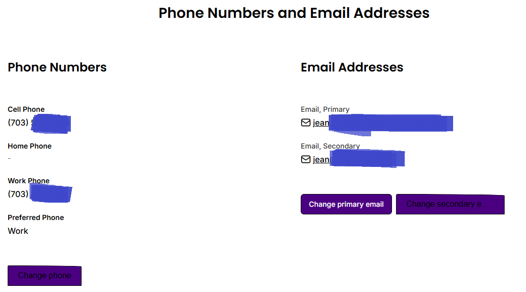
My use case is complex. The page contains a tabbed container with three tabs. The first tab contains several blocks, including two column container blocks. Inside the column containers, each column contains an item details block.

In one column container, each item details block contains one action button. It renders fine.

In the other column container, the left item details block action button is bad. In the right item details block, the primary action button is good but the secondary action button is bad.

What’s bad? The button text is black instead of white. Also, in the secondary button, the top edge of the button is corrupt.

Do you have any suggestions? Softr is blaming the custom code.

Hi Jean,

Could you provide the ID of the tab container and the IDs of the two problematic item-details blocks?

Well, hardly knowing any CSS, I am going to assume you mean the names of the blocks in Softr (knowing that I’m probably wrong).

The parent tabbed container block is named tab-container. The child column container block is named phone-email-container. The two item details blocks inside the column container block are phone and email.

Here is how to find the block ID (for any block).
See the the right part of the image. Here for example the ID of the tab container is tab-container1

Thanks! Those are the IDs that I gave you.

Okay, now next step: copy paste the code you have in your page so I can check it.
You can use the </> option when replying here to highlight it.

Is it the only custom code in this page?