I have a list of tasks that have planned and actual durations but can’t see a way to display planned vs actual values on a chart. I can only add one metric value. Is this something that’s being considered?
1 Like
Hey @sarah_h,
At this moment yes, you can set only 1 value. But as a workaround you can use a column container, add the charts next to each other and show different values for each chart.
Hi Suzie, is this on the roadmap to implement multiple series for one chart?
Hi,
Is it possible to add styling /editing options in order align the number centrally (horizontally & Vertically…)
@Suzie
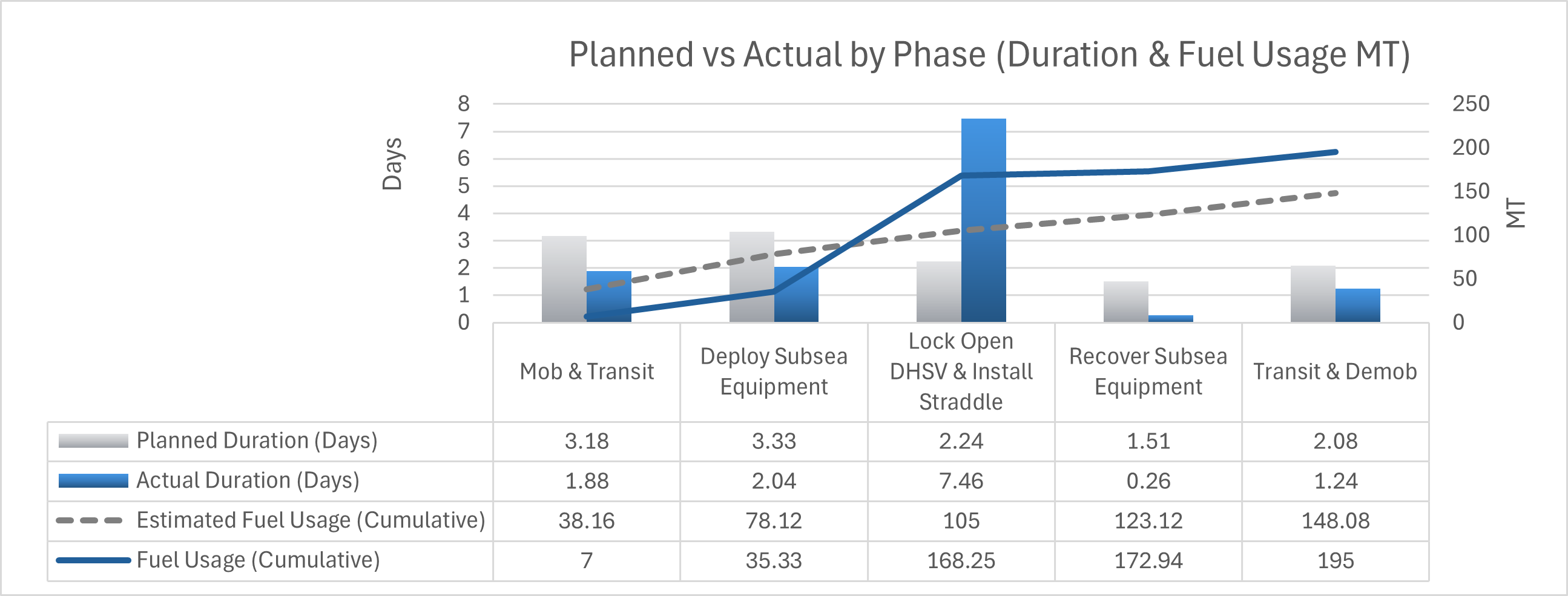
This is the type of chart I need to produce (this one is done in excel - obviously by moving to a database we are trying to get rid of using multiple excel sheets but we need to be able to produce this type of output) If multiple data series is not going to be available any time soon then is there any workarounds? Any plans to implement 3rd party plug ins like Bubble do?
1 Like
+1 on this, I’m currently testing Softr, to see if the Softr should be our next nocode platform, want to migrate away from our existing platform. But I’m having a lot of charts and some of them have 3 to 4 metric values on the same chart
Just wanted to check if there are any plans to update the chart blocks in future? I can see people have been asking about it since 2023.
I appreciate we can add separate charts in columns etc in the meantime but it isn’t ideal. Honestly for anyone who wants to make meaningful use of charts in app this lack it renders them close to redundant which is really frustrating - especially given charts are a feature on the higher paid plans not the regular/free options.
If it isn’t on the agenda that’s fine - just thought “at the moment” suggested it might be!
Thanks.
+1 I also need to be able to plot multiple series in a line chart. This is a basic function in any line chart in excel, google chart, etc. If softr is not currently providing this features, are there any workaround, such as connecting google chart to the softr native database?
@wzheng263 in works, most probably will be released next week
2 Likes
thanks!
Hi @artur I was looking at the new chart features and although I can add multiple metrics, I can’t add any filters or conditions to them (this can only be done at the source level)? Is there more functionally to be released later with this?