Hey, with the new update that added action buttons, we have lost the ability to add buttons as a field type in the details section of the inbox component. Buttons now have to be added via the actions tab, however if you have multiple buttons the buttons will not wrap to a new line and the label will be replaced with “…” which is poor UX. Before this update, buttons could be ordered to sit amongst other content, rather than listed at the bottom. The wrapping issues also did not exist.
I have already had a customer complain about how hard it was to find the wrapped button.
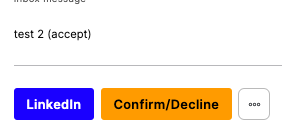
I would like to have the ability to order the buttons in amongst the other details content, rather than being forced to have them all as one line and loose the button label. The full button label needs to be shown rather than 3 dots.
Dear @zhardman, thank you for sharing yoru feedback with us! Indeed, the action buttons are shown with 3 dots when there are several of them. But, we will definitely consider changing/improving this feature in future app improvements!
1 Like
I love the three dots, the ability to choose between both options would be amazing to adapt it to different use cases 
3 Likes
Indeed, it would be a great feature to be able to choose between the 2 options. Thanks for the insight!
1 Like
+1 for the ability to allow the buttons to span the space of the area… the three dots are good for some use cases but for others I want to have multiple buttons visible for multiple quick actions.
3 Likes
+2 for the ability to choose “…” or wrapping buttons to the next line.
Two buttons wide limit on desktop doesn’t make sense when there’s plenty of room for more buttons.
Softr, please help us out here and give us options. This design choice is severely limiting my app.
are we going to get more buttons? it would really help with our project!
has anyone made embed code that has the functionality of buttons?
-Doug
@dojaeuger had a great question. I’m very new to Softr and am so surprised we can’t do multiple buttons! hoping this’ll be addressed soon?