Hi,
As the title of the topic says, the edit option (pen icon) for my users is placed below the tag element of the card, as you can see in the image below.
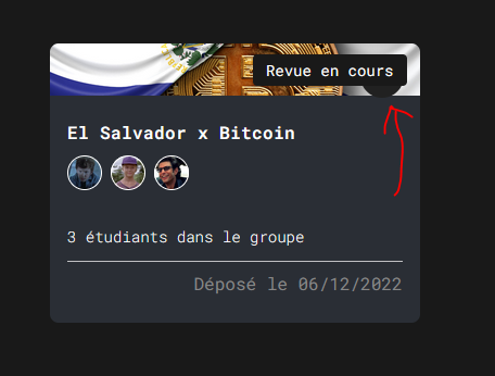
Then, it is very tricky for users to notice this option in the first place. Although, it can still be clicked and used if you notice it.
Probably could be fixed by adjusting the Z-index option of the tag or the edit icon.
Also, adding a page or block refresh after each edit could be very nice for the User Experience.