How to have more control over block sizing on the page

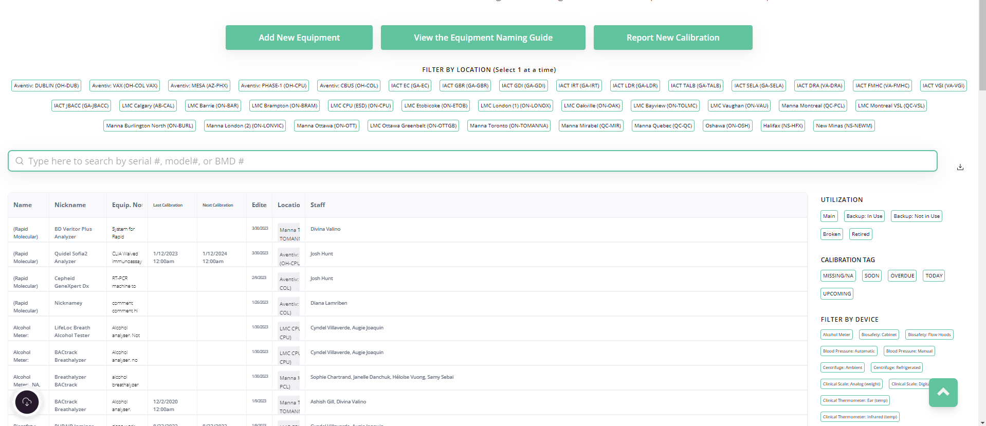
I don’t know if anyone out there has better ideas for approaching this. Basically my app needs to meet a lot of different team’s needs for our organization, which means I have to present a lot of information above the fold on pages. Some teams want the full grid view on their app, other teams need multiple different pre-filtered lists using list blocks.

Having the grid/chart take up the full page in many of these instances looks crazy aggressive and it’s not easy on the eyes (see example)

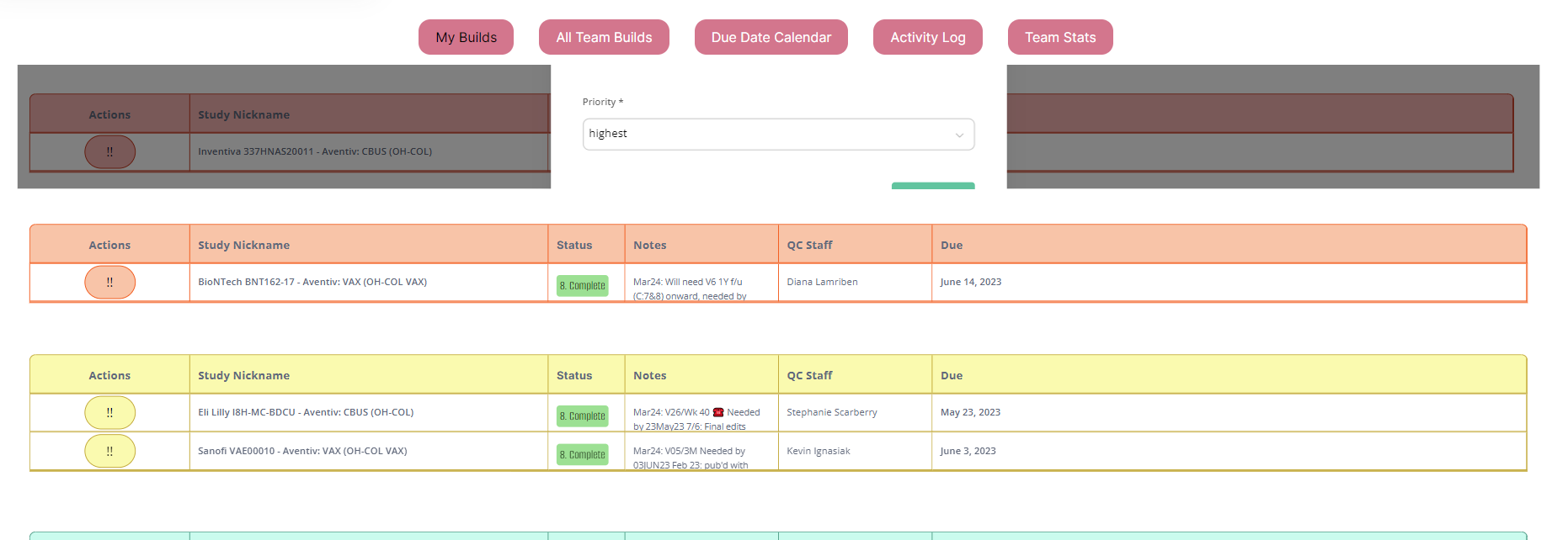
So my “hack” has recently been coopting some code shared by another community member and slightly shrinking these blocks in the header’s custom code like so:
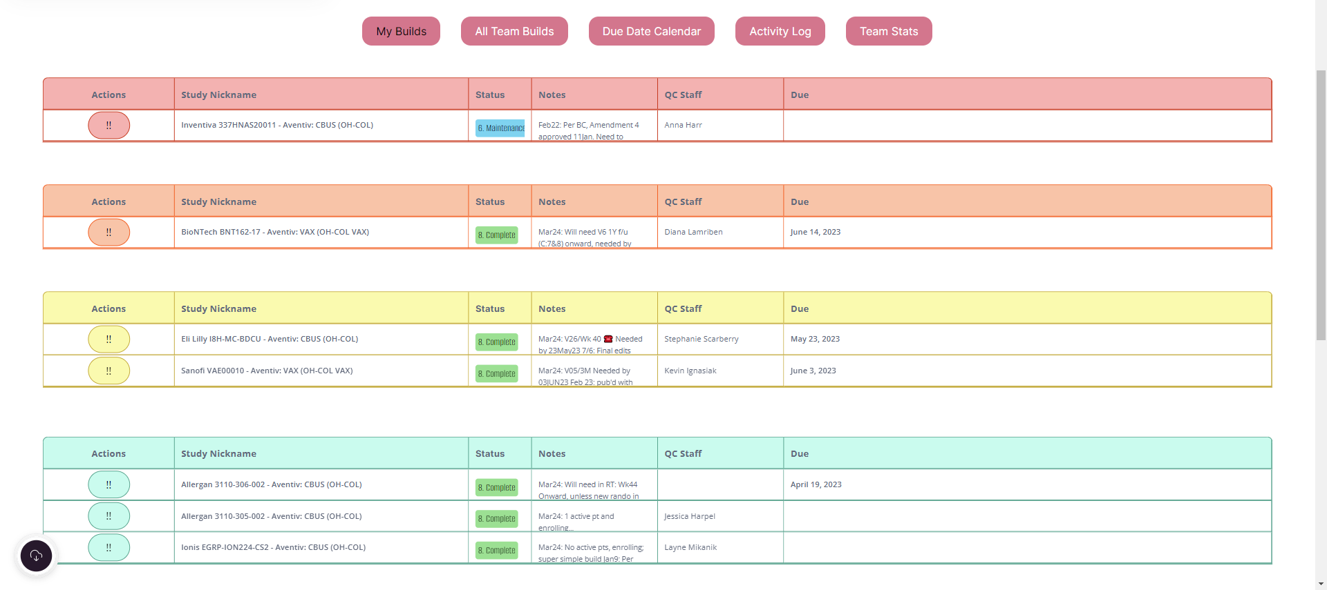
<style>
#highest {
  transform: scale(0.95);
  transform-origin: top;
}
</style>

etc
My issue is that while this looks WAAAYYY better, it just breaks about 80% of the blocks functionality because trying to use action buttons does not work. I’ve had a ticket open for about a month now and no resolution in sight, so I’m wondering if anyone else in the community has discovered alternative workarounds.

Examples of the stuff it breaks:
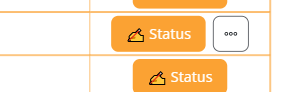
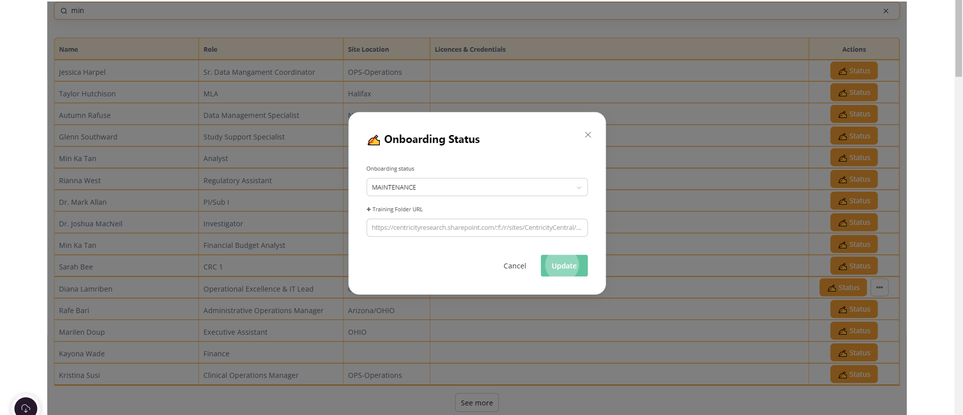
Trying to edit by clicking one button results in this (the whole dang popup is messed up. I tried playing with changing the sizing of the popup using some suggestions from matthieu & ChatGPT but I finally gave up because I really am a “no coder” :frowning: )


I legitimately cannot click second action buttons AT ALL. Clicking the three dots gives a brief hiccup where it tries to show me the button but it disappears before I can actually click it Link to the Loom I shared with Support Team
image

aaaand now for some reason the previously functional button I used to update a records status just does not work any longer. I can click update all I want, the button/edit modal remains and after refreshing and clicking everything on the page I can confirm it is definitely not saving my changes

I’m sure it has something to do with my wanting to resize these damn blocks on the page. I can’t revert my site back to the default/narrower view, it will piss way too many teams off. But I can’t continue using my hacky shrinking of block code without it rendering the interface a piece of non-functional junk.

Has anyone else out there figured something out to address this issue without breaking their editing capabilities?

Hey @danyalamriben, before guys will check and share their feedback with you, can you please check your app on another device? We did many tests and found out that your described bug is present on a specific device.

P.S. I also checked your app on my device and the 2nd button worked as expected.

1 Like

Hi!

Me again!

Let’s make it more simple. Forget the resizing (transform scale = bye bye) and just play with the width (play with “1000px” only). Change #list1 by the right block id. The modals shouldn’t be affected.

I disabled those changes on mobile.

Also it should be easier to maintain, some of the selectors I gave you may disappear in the next weeks (specifically all looking like ‘.cssxxxx’ related to action buttons or any button)

<style>
 #list1 {
  width: 1000px;
  margin: 0 auto;
}

@media (max-width: 767px) {
  #list1 {
    width: auto;
    margin: 0;
  }
}
</style>
2 Likes

Hi Marine, yes it is true that on my ipad and iphone it works, but unfortunately that doesn’t really help resolve this issue. As silly as it may be, the “specific devices” happen to be all of our company laptops haha. We also typically use a minimum of one additional widescreen monitor, to help others understand why I find shrinking some of these blocks attractive. Full-width blocks on mobile screen? No problem! My giant monitor? Woah there!

I’ve had multiple coworkers screenshare for me using both edge and chrome and the effect is still the same. And oddly, I know that my coworkers have different computer models, since my Dell is a bit more powerful than the standard ones they give staff. I always keep my browser versions up to date as well.

I’ve been having to figure out a lot of “over engineered” workarounds for users to accomplish simple workflows, all because I can’t make the normal buttons do normal stuff haha. I know, resizng is probably the culprit, hence my invitation to hear alternatives.

You had me at “transform scale = bye bye” :heart_eyes: I will start attempting this now! Thank you :slight_smile:

Curious about the selectors disappearing, I’ve been trying to dip my toes into more of the backend to troubleshoot various things and figure out how to improve the experience for users… will this be a large shift do you predict? Like, will it make it harder to use custom components or use event listeners (or fingers crossed, make it easier?)

not like I can do much custom coding now… but, I wanted to figure out how to get confetti when a user clicks save for new trainings uploaded :crazy_face: (this redirect is fun enough for now https://centricitycentral.softr.app/you-done-it :clown_face:)

You are my HERO! I wish I could give you an award LOL Season 9 Nbc GIF by The Office

It worked. Thank you so much!

No problem for event listenners as they relie on “submit/edit/add-record/form-success/fail”.
This should be done for button class selectors (so not event listenners). Anyway there should be a notification in the community from Artur.

Concerning confetti: what is the button type? action button? the button of a classic form? If it is a classic form, is it displayed in a modal? (a video or image would help)

This is working great for my specific block, but it is showing a white space to the left and right of the block which looks awful compared to the rest of the page.

<style>
nav, section, footer {
background:linear-gradient(90deg, #0DB8E6 0%, #0DB8E6 100%) !important;
}
.container{
    max-width:1600px
}
 #list-details4 {
  width: 1000px;
  margin: 0 auto;
  background:linear-gradient(90deg, #0DB8E6 0%, #0DB8E6 100%) !important;
}
</style>```