Hello everyone,
I’ve been using Softr for a week now. Due to many limitations, I had to combine and adjust multiple settings to achieve what I needed. However, I’ve now hit a roadblock.
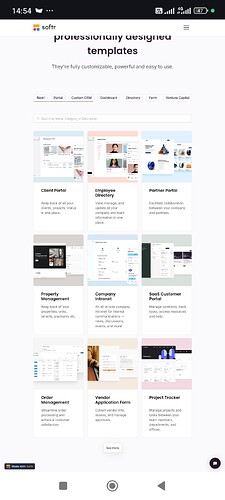
With the automatic layout adjustment, when the website is opened on a mobile device, the product arrangement is forced into a single-column format. This takes up a lot of screen space—where I could have displayed 4-6 products per screen, the current layout only allows one product to be shown at a time. I see this as a waste of valuable selling space.
So, I’d like to ask for advice from everyone: How can I solve this issue?
I was wondering if there is any custom code that could:
- Disable the automatic layout adjustment.
- Allow users to choose their preferred layout when viewing the site on mobile.
I have attached an image of the desired product layout when displayed on a mobile screen.
Looking forward to your suggestions. Thanks in advance!
