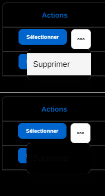
This worked a charm!
For anyone else needing this, I adjusted the code so be the following (as I want a white modal with black text)
<style>
   .MuiAutocomplete-popper.MuiPopper-root * {
    color: #000000 !important;
}
</style>
This worked a charm!
For anyone else needing this, I adjusted the code so be the following (as I want a white modal with black text)
<style>
.MuiAutocomplete-popper.MuiPopper-root * {
color: #000000 !important;
}
</style>
Hi,
Do you have the “< style >” code to set the background color and the writing color of the drop-down menu, please ?

Hi James,
This code is excellent.
Thanks for the help!
It should be this:
<style>
#list-details1 .MuiIconButton-root:hover { /*list-details1 to be replaced by your actual block Id*/
    background-color: black !important;
    color: white !important;
}
</style>
Sorry for some reason I gave you the code for color change on hover on the X button (??? ![]() )
)
So for the borders of the inputs, on hover, it could be:
<style>
#list-details1 .form-input-component-wrapper:hover {
    border: 1px solid red !important;
    border-radius: 9px !important;
}
</style>
Note that .form-input-component-wrapper might not be perfect but this is the simplest (otherwise you have to find all selectors for all input types…)
It’s working - just needs some tweaking. I have added a little pop shadow (ignore that). The issue is that the original input seems to pop in front of the new border, breaking the corners.
And if I reduce the radius down to 2 or 3, it doesn’t break through - however it changes the entire input to have a super low radius which looks a little odd compared to the rounded inputs on the rest of the modal. All first world problems, of course.
This is the file field:
Unfortunately, this is how it is. You will have to make do with that for now until Softr releases an update on it.
Going further would take me too much time.
Even if I suspect that you could apply the same border radius as the hover version like the updated code below, but absolutely not sure.
<style>
#list-details1 .form-input-component-wrapper {
    border-radius: 9px !important;
}

#list-details1 .form-input-component-wrapper:hover {
    border: 1px solid red !important;
    border-radius: 9px !important;
}
</style>
In any case, just go with the first option breaking the corners, still visually better.
No problem at all - you have solved my problem for me and I massively appreciate your time!
I’ve found the best result I can get so far is to use this in the app setting custom code:
<style>

    .form-input-component-wrapper {
    border-radius: 9px !important;

}
    .form-input-component-wrapper:hover {
    border: 1px solid #6A14FF !important;
    box-shadow: 0px 0px 6px #cccccc;
    border-radius: 2px !important;
}
</style>
Hello,
Nobody has a solution?
Have you find the solution?
I’m also waiting for this fix to go “live”…was told it was in testing last week, but judging from this thread, it has been an issue for some time. It is really hurting our app!