I sometimes can re-use and adjust shared custom codes, but this (and Claude AI) could not help me with a proper solution:
*** Context
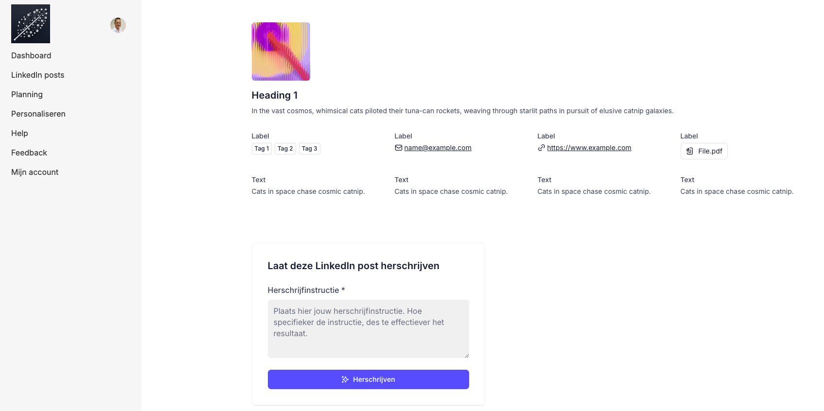
I have list detail page with a list-details block. Below that block there’s a conditional form block. And below that a comments block.
*** Challenge
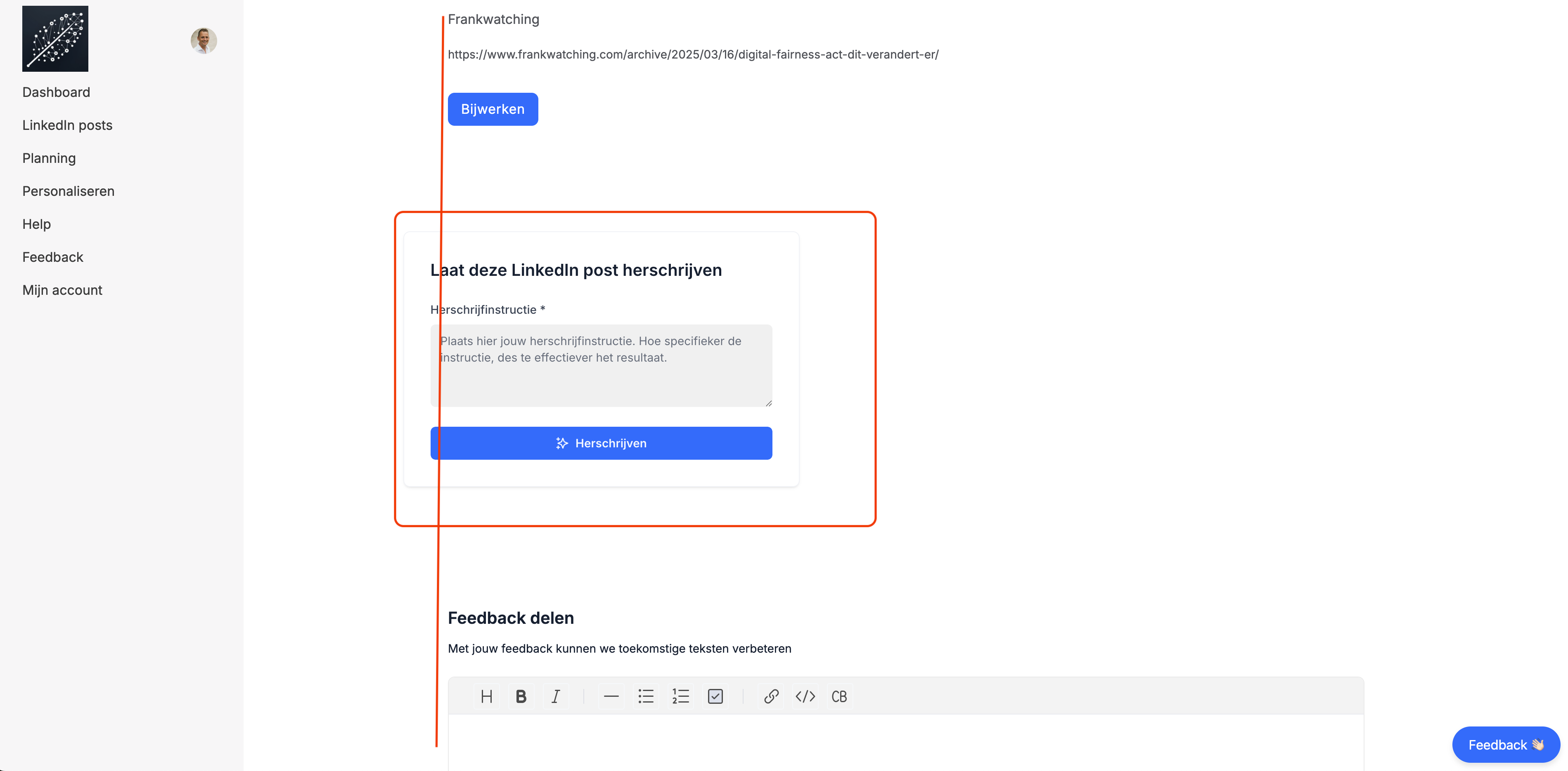
As you can see in the screenshot below: the form block is not horizontally aligned with the blocks above and beneath it. I’ve tried various AI-generated css style codes as a custom code in the header of the page, but without a good result.
Is there an easy way to align this form block correctly?
Thanks in advance!
Thanks for thinking along! Unfortunately adjusting one or both of these options did not lead to a proper alignment:
The new details block has the same alignment as the old one and also the comments block I’m using. It’s really the form block (new type) which does not seem to have the same alignment (I’ve tried all form layouts, I’m now using the half image without an image, since there’s no ‘left aligned layout’).
I’ve experimented with changing the site width in the theme configs, but this did not result in a better alignment
The comments block is an old block, which makes me think that you’re also using an outdated list details block. Anyways, maybe time to think creatively?
How about using tabs for the form + comments block? That should align the two well.
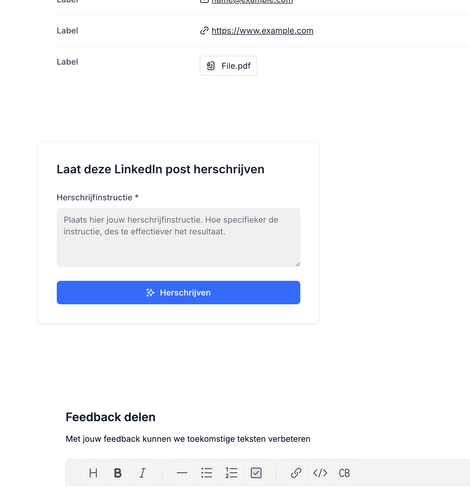
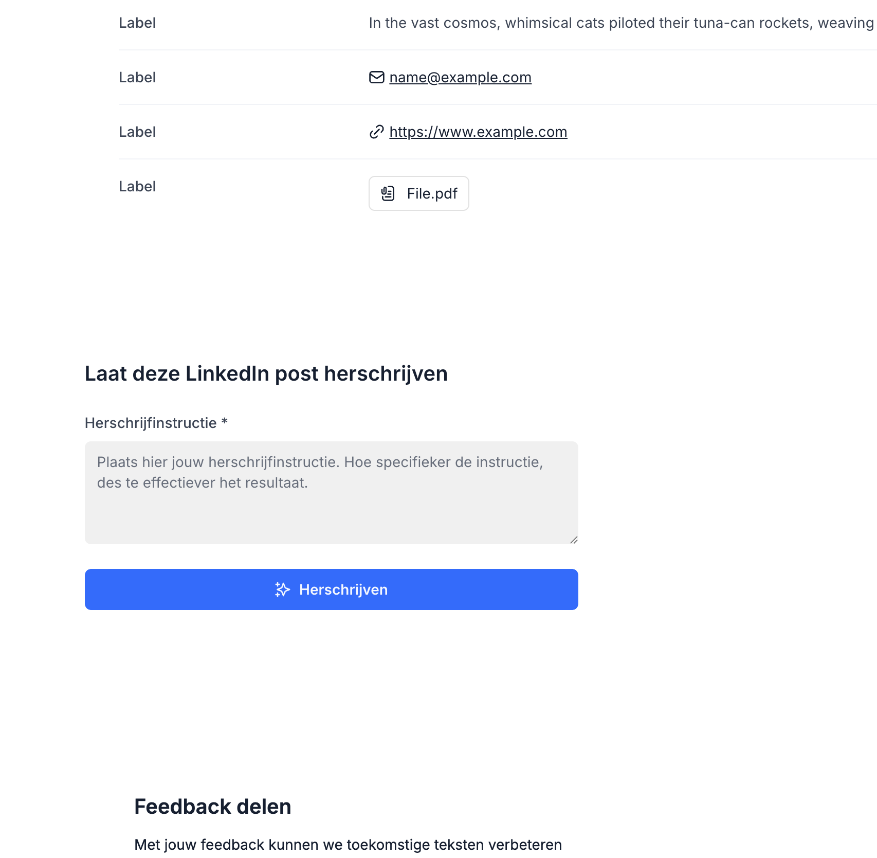
Thanks for your feedback, I value it. I really did try the new list details block: see alignment result below. The container alignment differs from the new list details block since there’s no container around the list details block. When I hide the form’s container it’s also not aligned.
Thanks for suggesting the tabs. I’m using the tabs on other places, but not on this page because of the clear link between the top list details block and the 2 blocks below where the top list details block should imho always be reachable via scrolling instead of a tab because:
the list details block contains a created social media post by me
below that is the form which triggers an AI rewrite of this post: an user needs to scroll the page to the post above to adjust the rewrite instructions instead of reloading a tab
the comments are comment’s on the post, and as such listed below in line with industry defaults
At the moment, the misalignment of the blocks outweighs imho using tabs. That’s why I indeed was trying to think creatively by looking into the custom css styling.