There’s a few posts in the community about this but couldn’t see a feature request so adding here for reference.
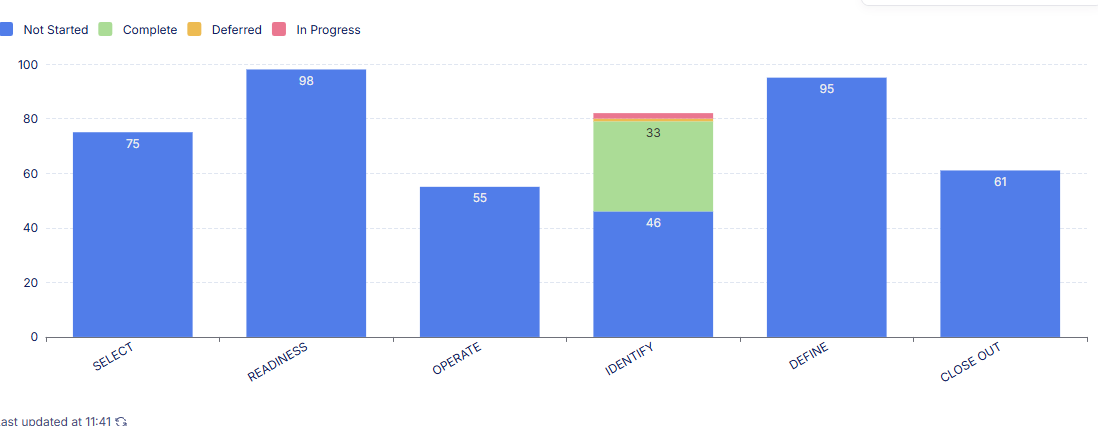
On charts, its currently only possible to sort chart values Z-A or A-z by categories or values. We need to be able to have a custom sort option so that we can order in a specific way. In the example below, I need to be able to display this in order of our project process which is Identify, Select, Define, Readiness, Operate then Close Out:
Additionally we would also like to be able to define the order of the values that are stacked e.g. Not Started, In Progress, Complete
I’ve looked at adding a number in front of the values but this doesn’t look great as the numbers have no relevance. Maybe if we had the option to sort by a hidden field I could tag values in the back end and sort by that but display the category on the axis
@Jjenglert is this still in the pipeline? My chart is unusable at the moment because the ‘Months’ are all in the wrong order - ‘as defined in source’ would be ideal
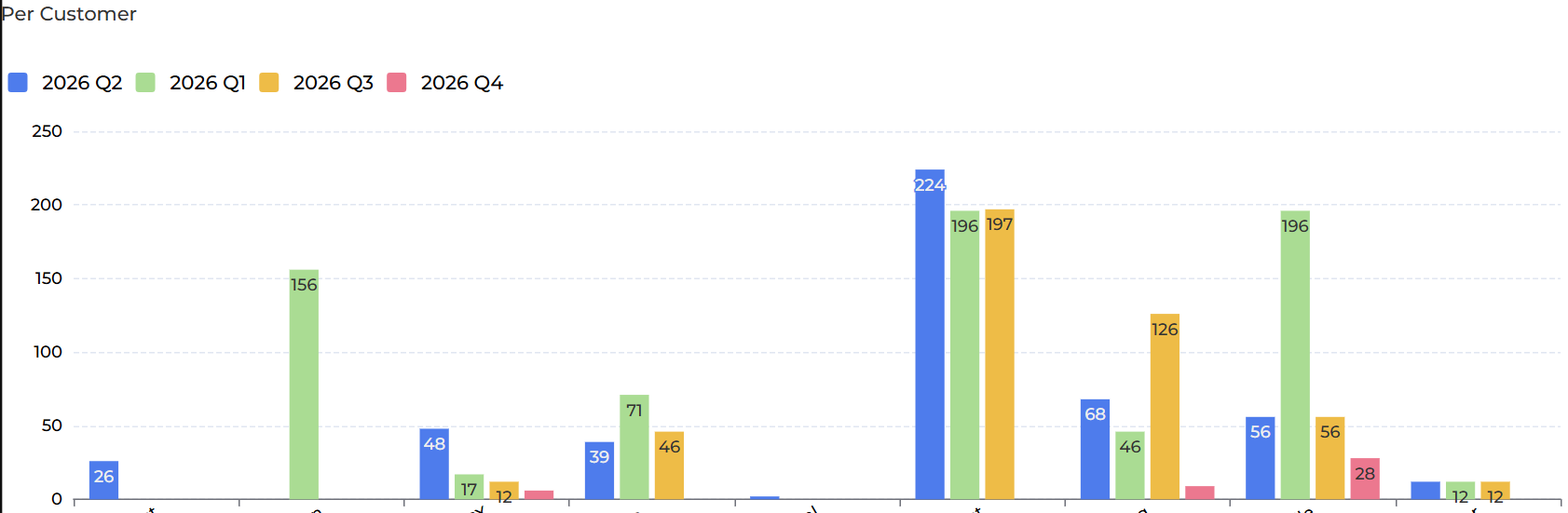
Adding to this thread an example where custom sorting is crucial for usability of dashboards. I have a chart where we show requests per project type across different quarters to show trends, but the quarters are not displayed in a correct order by default. The chart is currently set to be sorted by categories A-Z (which the project types are following), but the Q2 bar is showing before Q1, making this chart unpresentable to clients.
If this is caused by a bug that could be fixed before the implementation of custom sorting, it’ll be greatly appreciated if the Softr team could take a look and address the issue!