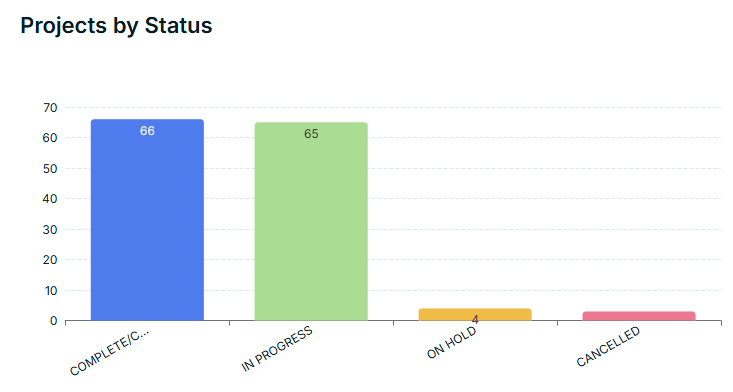
However, this functionality doesn’t work and you can only have charts coloured as a single colour or a random selection of colours. The random selection isn’t great as there is no control of what colour is used for what value. Example below:
In this case ‘Compete’ should show as ‘Green’, ‘In Progress’ as Orange’ etc.
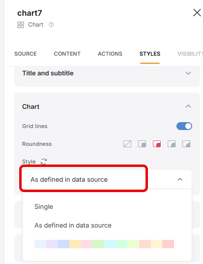
We need the ability to customise what colours are used for specific values and having the ‘as defined in data source’ option would solve this issue.
@Jjenglert@artur I know there’s a lot going on just now with the new tables feature, comments block etc. but just wanted to try bump this one up the list again as it’s one thing stopping me from utilising the charts to show projects progress as the data looks wrong based on the random colour selections. I have tried getting custom code to work but it doesn’t work and being a no-code platform I’d hoped this functionality would be available as I’m not comfortable with using code.
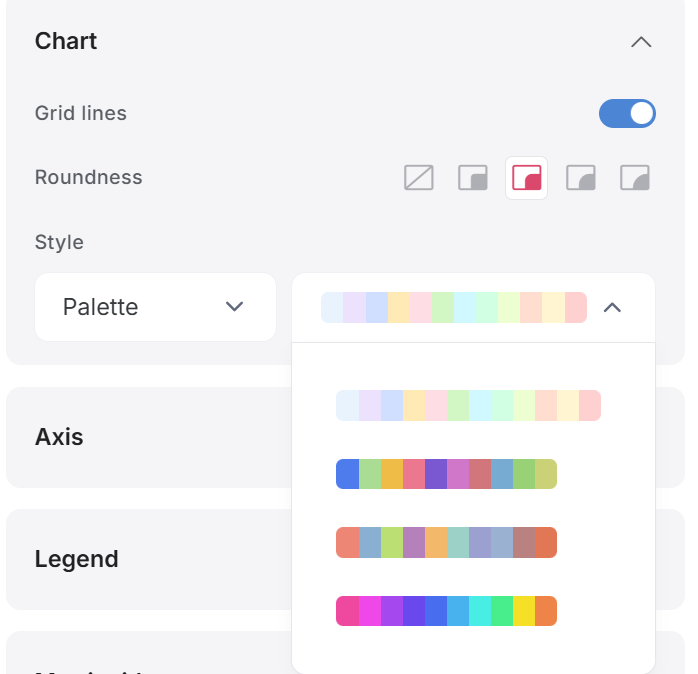
I’ve noticed a change to allow different colour palletes to be chosen and the option to set ‘as defined in data source’ has been removed. Is this still being worked on as none of the defined colour palletes work for us. We really to be able to set it to as defined in data source to make the colours make sense:
Yeah, we are definitely still working on this and understand the need our community has for it.
At the moment, this update is grouped into a bigger theme update which is slowing it down at the moment. However, we still plan to deliver on it this quarter (Q3)
Is there any update in this topic? We also need it, as the status tags for several items don’t make sense when the colours differ from those used in the graphs.
Don’t have an update for you at the moment, but it’s known as a high priority item and we’re working on new theme elements that will incorporate custom colors on charts + calendars, among other things. Will keep this thread updated as I learn more.
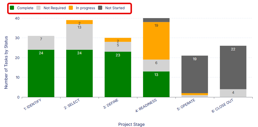
I’ve managed to add some custom code on the page to change the colours of the charts, however, because I can’t set the sort order of the values (it seems to change for no reason) - I still get incorrect outputs. See below (1st example, looks great, 2nd example is a different projects and the values are in a different order so colours don’t work)
Ideally, we want to set the chart colours to ‘As Defined In Source’ but as this is taking longer than originally expected, I’m hoping someone can help with a bit more advanced coding (my knowledge is limited) to allow the order of the values to be defined and/or specify which values the hex code colours should be used on. This is the one main thing preventing us actually using the app (we can’t launch this to clients when the colours don’t reflect the status)
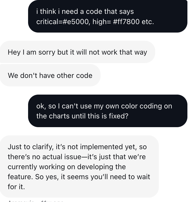
I also tried the custom code (& spoke to support about it) - it jumps around when the value’s vary so it’s not usable. Support said that what I was trying to do wasn’t possible but they are working on this feature - this was 11 weeks ago.
That’s a pity I was really hoping we could get a workaround.
We had to delay launching our app because of this issue and originally it was expected end of Q2, then beginning of Q3 but now I’ve had to go back to management to say I don’t know when it will be ready so we may have to look at other options which is frustrating given the time and effort put into this (it’s 95% there but it’s definitely a blocker of us as client facing so we can’t have it showing colours that don’t correctly reflect the status)