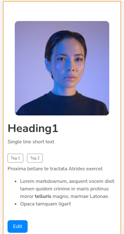
I’m surprised no one has brought this up yet to optimize screen space. Unlike legacy list details blocks, everything is left aligned in newer item details blocks with too much white space on phone screens.
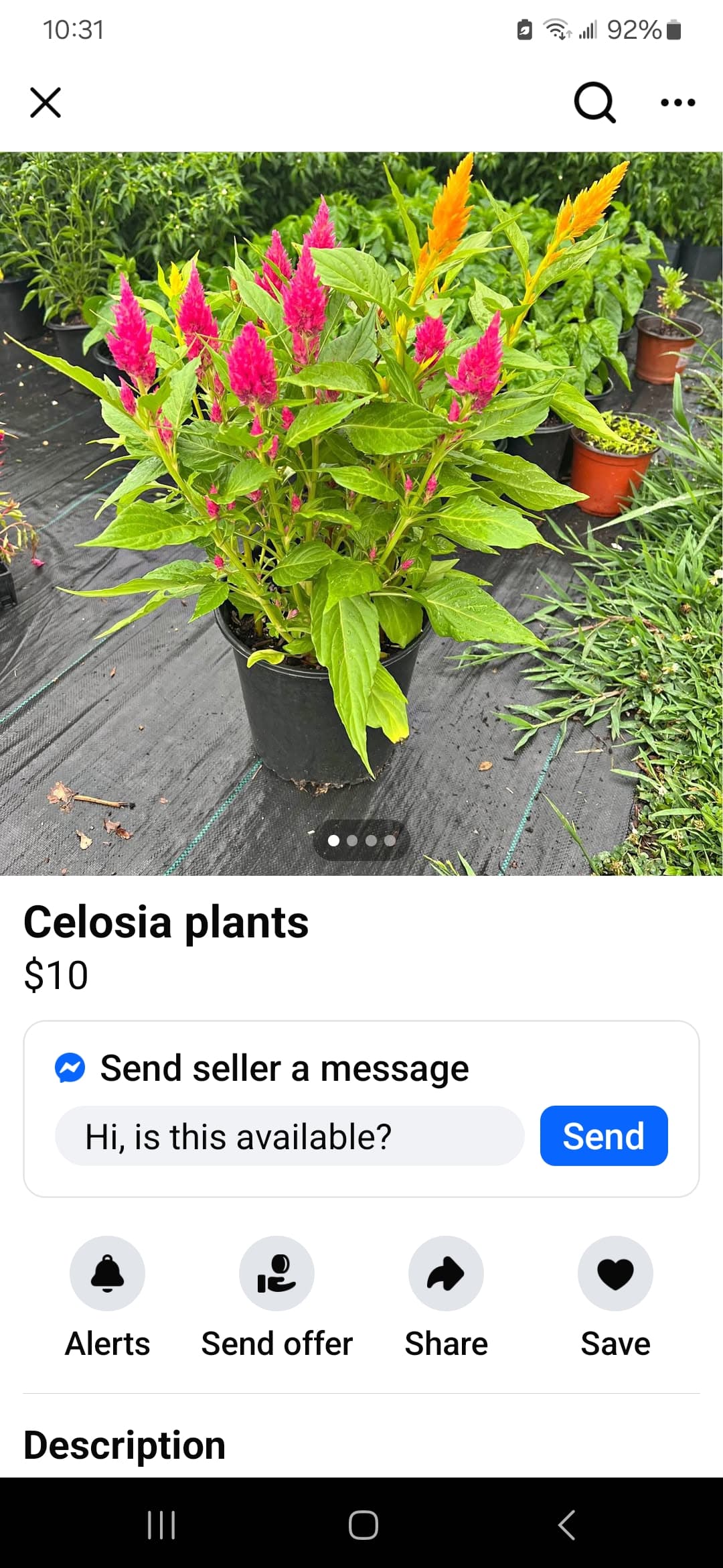
Hey JJ. It’s been a month. Is there a timeline yet for aligning at least the cover image on mobile? As it stands, new blocks still aren’t optimized like legacy blocks.
Hi Ben - spoke to the team about it again and it’s something we still plan on updating. No timeline yet, but hoping it gets updated soon just like you!
Right George. Shouldn’t have to use custom codes when we already had this layout on legacy blocks. Not to mention, codes affect the stability and performance of blocks on pages.
@artur@Jjenglert it’s been 7 months since this was first reported. This is a standard mobile experience that legacy blocks had. Softr has not bothered to fix this all year.
@artur, revisiting this again… , 10 months later. We would like to use ‘comments’, but not in item details current format. Please see original request.
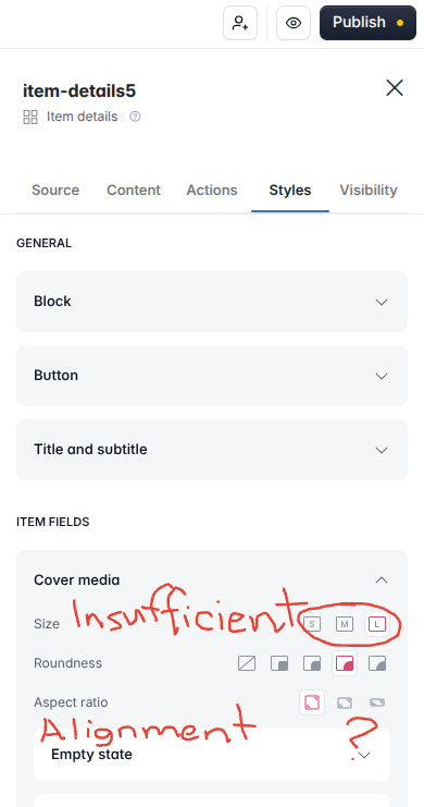
Hi @artur. It’s been about a year now since this was first reported. Unfortunately, I have to mention yet again since item details content alignment is still insufficient (see initial post). What is really disappointing is that legacy item details settings were great!
This is a good example of what users have been complaining about. Rather than releasing trendy new things all the time, focus more on improving core features that NEED improvement, ideally the ones mentioned here in the community.