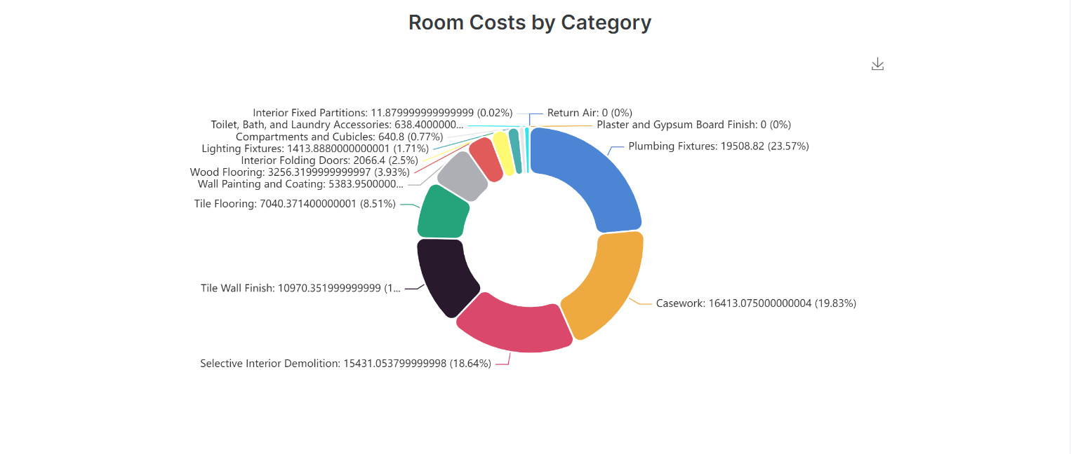
I’m working with charts but couldn’t find anyway to format the numbers. Numbers are displaying with a ridiculous amount of decimal points making the chart very hard to read. See below.
Anyone know where I can format this?
I’m working with charts but couldn’t find anyway to format the numbers. Numbers are displaying with a ridiculous amount of decimal points making the chart very hard to read. See below.
Anyone know where I can format this?
Hey @bfortunato, you will need to change it from your data source.
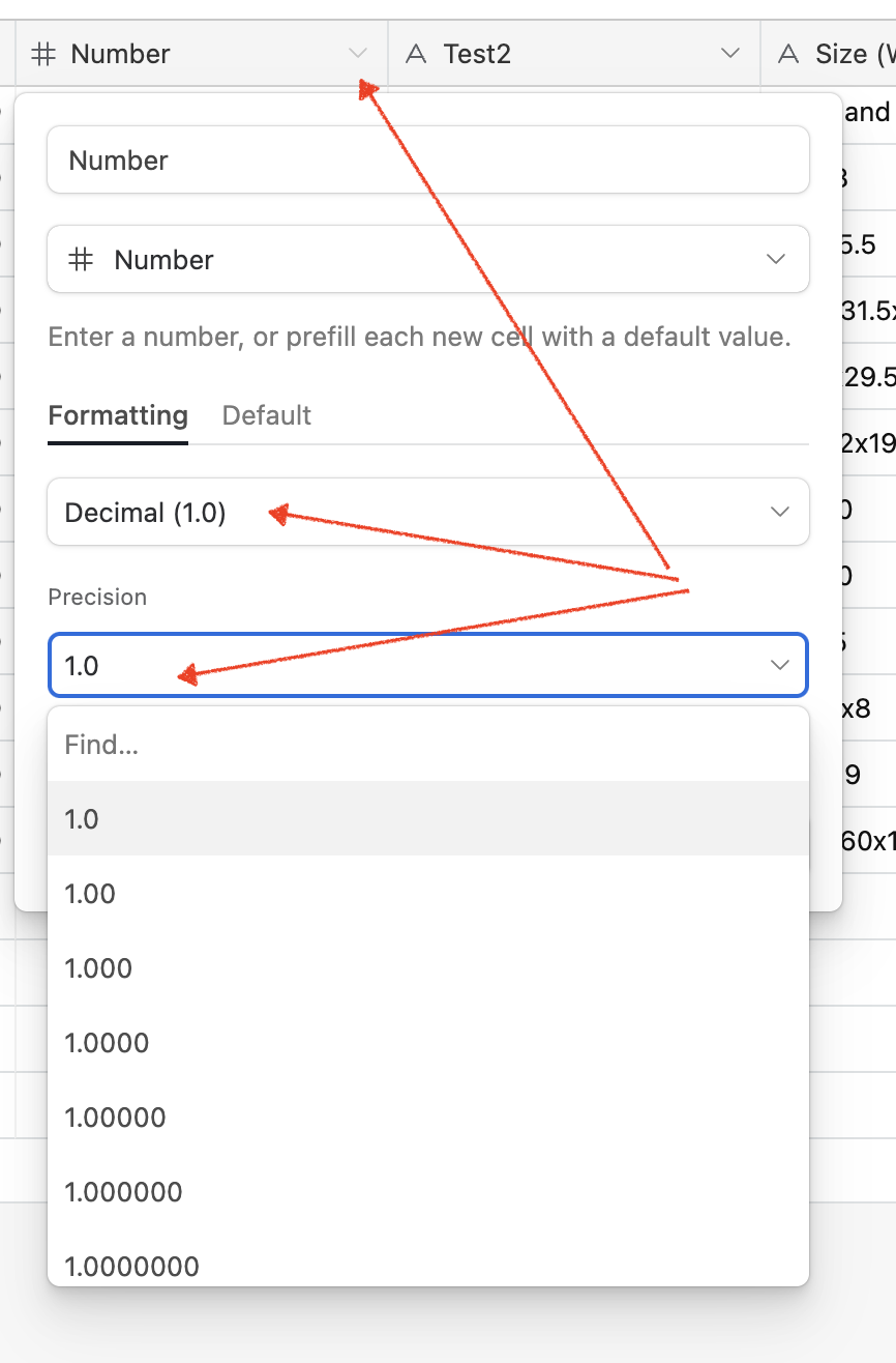
In the case of Airtable, you will need to open the column with the numbers you used, edit it and choose how many 0s you want to show after the dot (see the screenshot):
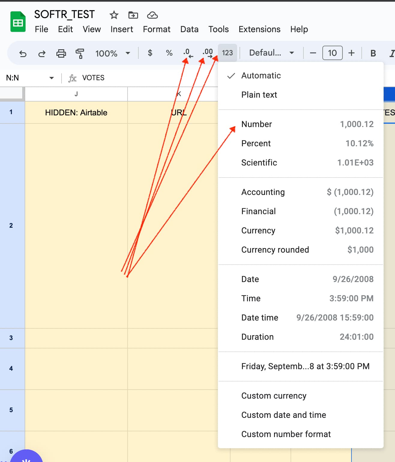
In the case of Google Sheets, you will find the option in the toolbar (see the attached screenshot):
I have that all set up, but then when you use the aggregate functions it overides those settings.
I think its a bug or missing feature in softr? Its doing the math and then outputting the results with its own precision settings but I don’t see anywhere to change those.
Yesterday I needed to setup some stats for a project, and I didn’t have any trouble with crazy decimals.
The numbers don’t looked formatted, ie comma or currency. Where you using one of the functions such as sum?
I have an airtable base set to currency formating and then I’m summing all values based on anouther field such as a specific category. That is what leeds to all the decimals.
Anyone able to replicate this error? Maybe it has to do with the fact that the numbers in my airtable are from lookup fields?
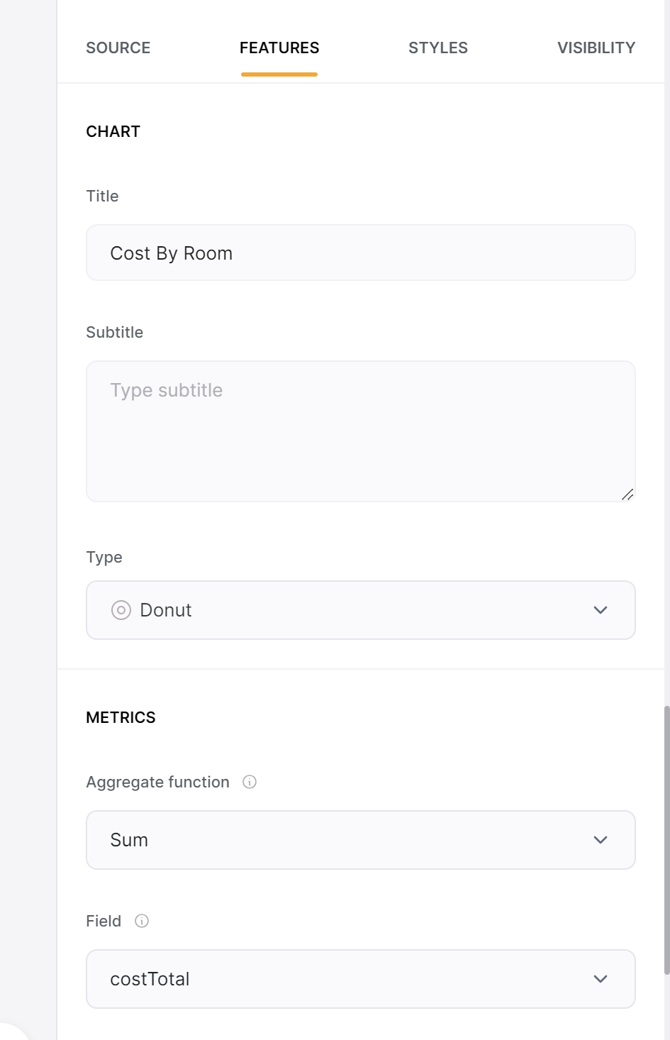
Are you using the rollup functions in Sotr to sum the values?