I’d like to be able to:
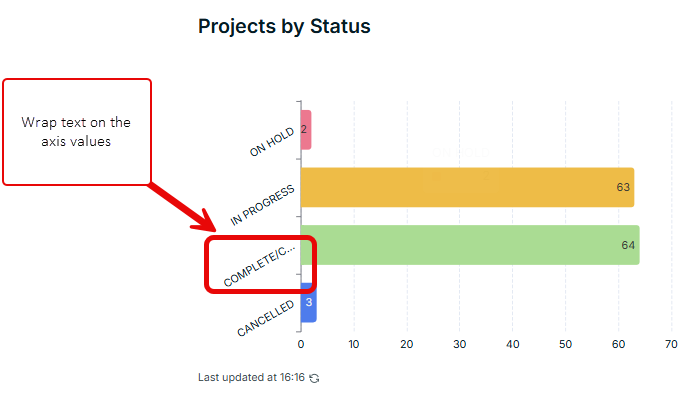
- wrap text on axis
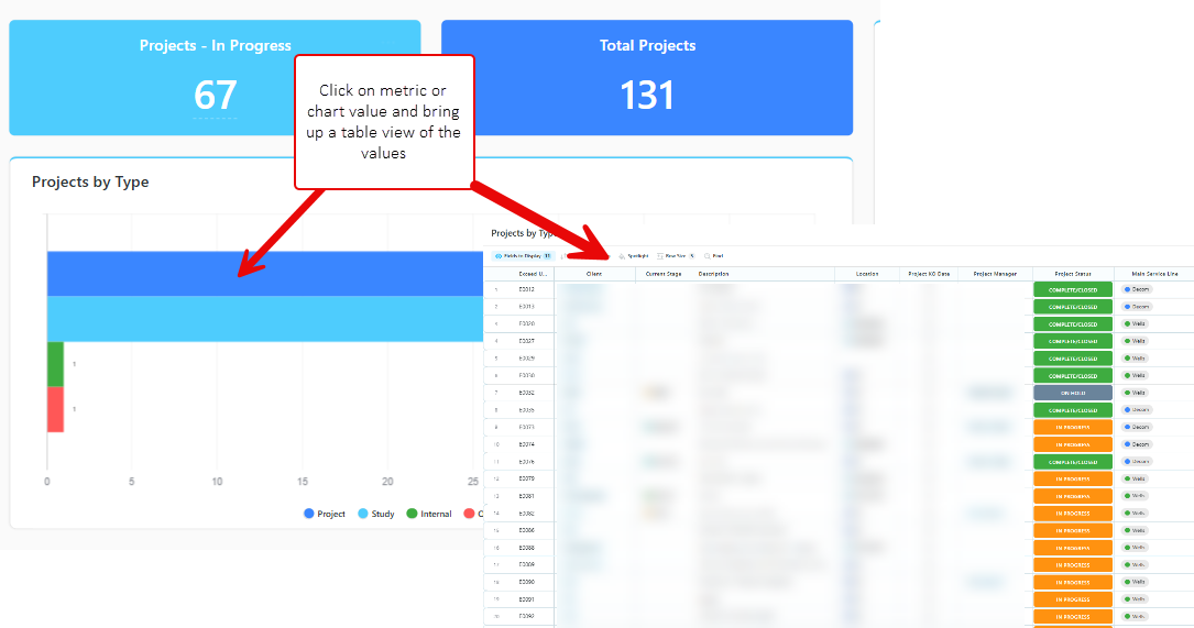
- make charts interactive so that when you click on the values it shows more details about the records
I’d like to be able to:
Hi @sarah_h can you visually share how you would like both to behave ?
Hi @artur I’ve attached a couple of images for reference.
For the charts I have used screen capture from SmartSuite where our data is stored (we can’t use these dashboards due to lack of permission control so looking for a similar option in Softr)
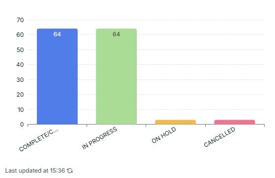
This requeste is much neeeded when axis items has long texts, and actually doesn’t much sense to limit to a few characters, the current version we can’t see even a single long word. Please @artur integrate in the pipeline, would be a little change with a huge impact.
@sarah_h @gfranco Have you considered using column chart instead if you know that the labels are long?
We can certainly tweaked the logic to handle longer text, but it’s unlikely going to be wrapping text in the horizontal bar chart.
Reason: The text can never be taller than the bar itself. Otherwise every label will be pushing down and out of order.
So at the end of the day there will always need to be some cut off, and if you have more series it’ll end up having the same result.
@austinyang yes but same issue is encountered with column chart. It just doesn’t make good use of the space available and this is on the smallest text size so can’t even shrink the text further. This on top of the inability to customise the bar/column colours is stopping us from rolling out at the moment
Yes, we need both of these too.
Ideally, more options for the text so we can wrap it or make it smaller to fit. The charts are unusable in some instances.
We would also like interactive/drill down charts so that the user can see more information in detail without having to go to the relevant table and find what they are looking for.
Adding another vote for this feature, more advanced axis label and legend customization would be extremely helpful. Specially the ability to either wrap text or adjust chart font size in a more granular level, as well as being able to adjust the order of the items in the axis beyond “Categories A-Z/Z-A” and “Values A-Z/Z-A”.
Not related to the features mentioned by the original post, with charts containing 10+ subgroups, the current horizontal-only legend display significantly limits visibility. Having the ability to display legends vertically and being able to select/deselect all legend items would greatly improve our data visualization capabilities.
Horizontal-only legend display: