I’d be interested to see screen shots from anyone who has made their app look better than the default. I’m finding it really block and tables don’t line up etc. Anyone have their looking more polished. I’m wondering if It#s worth paying someone to do some custom CSS for me.
Hi hiyakker,
I was wondering the same thing… so let me share what I currently have (I’m still in the testing phase and a common response from testers is that the website/presentation could be prettier ![]() ). Whether you need to hire anyone depends on your time and ambition I suppose… it took me already (too) many iterations to get to a simple and consistent design/layout/color scheme.
). Whether you need to hire anyone depends on your time and ambition I suppose… it took me already (too) many iterations to get to a simple and consistent design/layout/color scheme.
The main page is what is still under construction - but an easy improvement is Softr’s SVG-wave generator to help transition between sections/blocks on your website: www.neemjevoorsprong.nl
Behind the login-wall you would find this main menu for example:

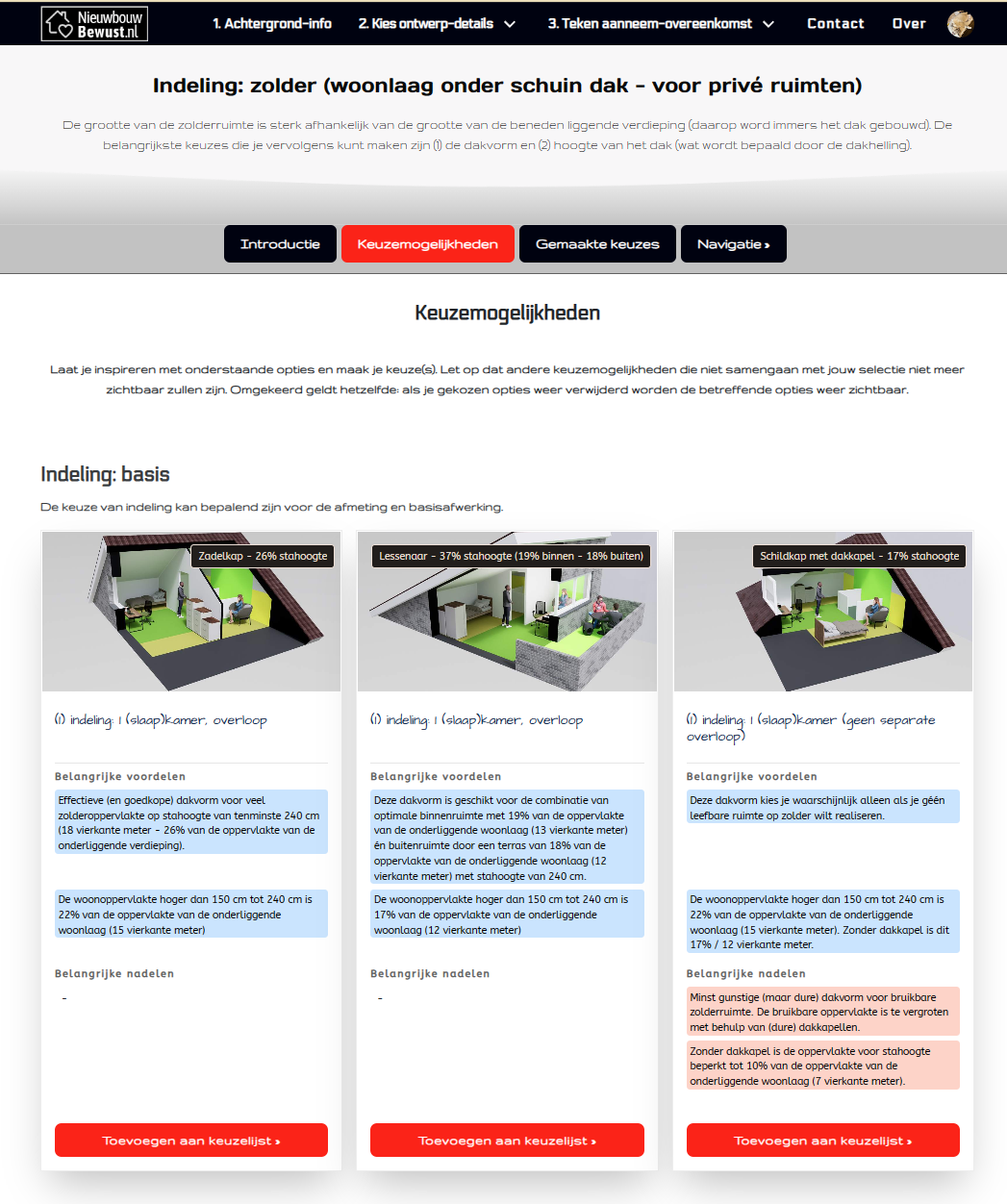
This is a menucard of a specific group - where users can make their choices:
Interesting. Everything comes out a bit 2000s looking doesn’t it? Block layout is my big issue. Just getting buttons and controls into sensible places - as well as what the UI elements look like.
Agreed. And the possibility to add background picures consistently on ALL blocks would already make a big difference (currently it seems a bit random what blocks allow for background pictures).