I would love to use this new block. Two things I miss in the Grid list:
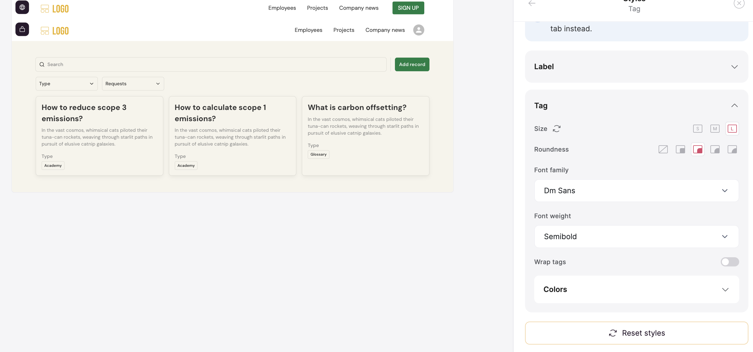
- Define the look of each filter separately (one filter within dropdown and the other within tags)
- Upvote button within each block would be dope
I would love to use this new block. Two things I miss in the Grid list:
Also loving the new block. One big issue for me is the new font sizes. The current largest font is smaller than what I currently use.
Also for the filter tabs, being unable to colour them the same as before could run into issues for me as I need them to be clear what has been selected (or unless I am doing it wrong).
Appreciate that the new blocks are in Beta. I was using it and was working fine, but now the ability to hide the block if no matches has stopped working. It shows the block regardless now.
Rookie mistake for using a beta so quickly, but I just loved the design so much!
@ianb can you share a short video on what you expect? we checked and it seems we maintained the old functionality
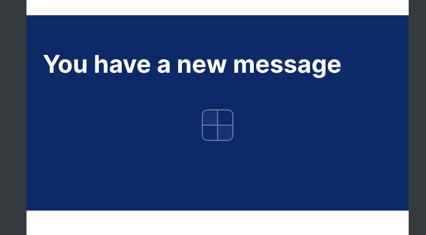
Hi artur,
Please see the two screenshots attached. I can put in a individual message for my users, so I did one for myself and as you can see it loads. I delete the message, so the block should hide, but it loads like this with the square box image.
@ianb we will release a fix next week
@ianb thanks for reporting this issue, it seems it did slip through the cracks, but we’ve just released a fix for it. The “When filter returns no result…” feature should now work as expected.
Also liking the new blocks so far. Experimenting with it currently, I think it might provide a nicer user experience compared with what I was previously using a list or inbox block for.
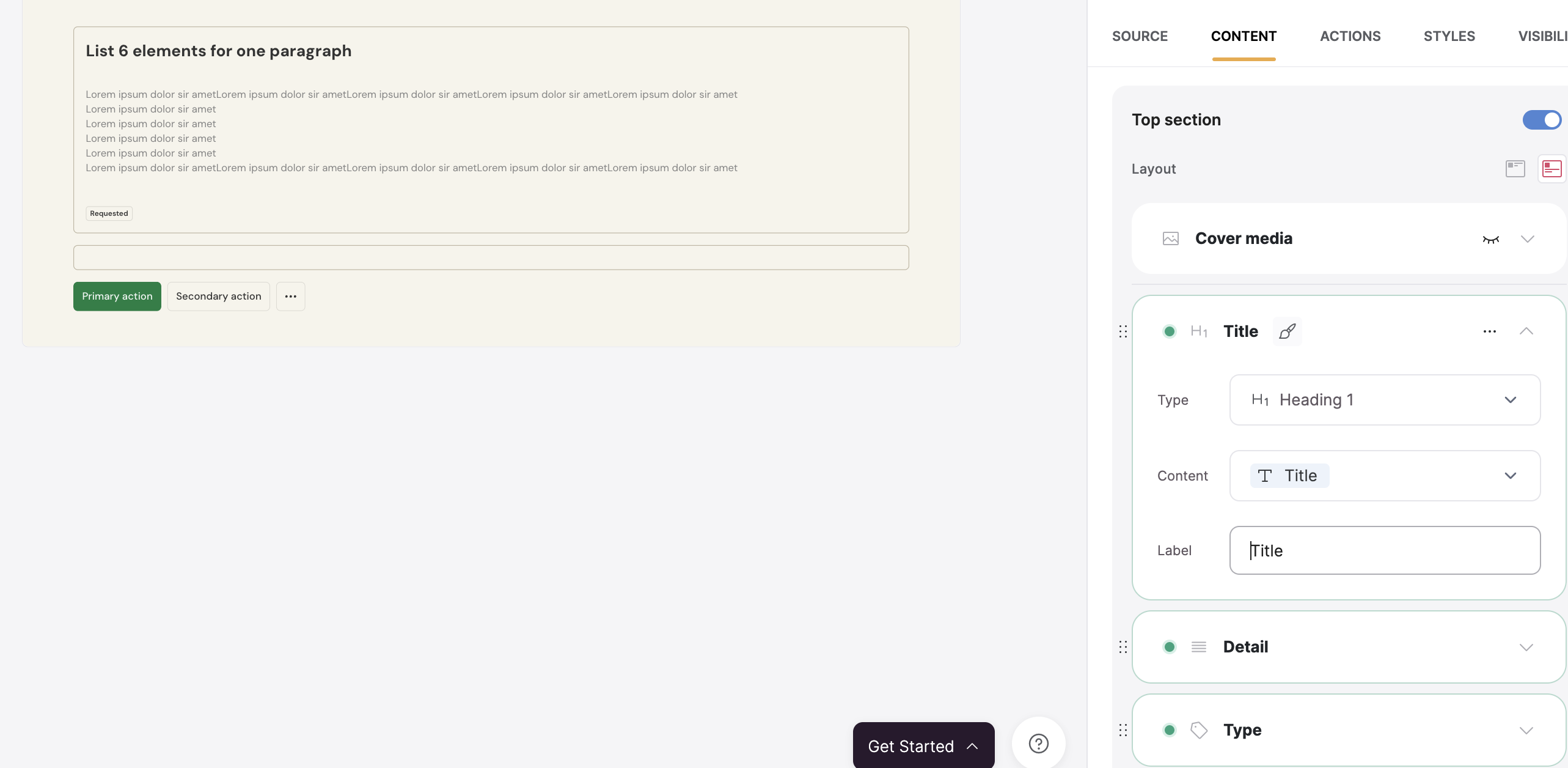
However, I echo some of the requests for more flexibility with formatting options. Currently I can’t seem to customise the width of button borders, so the styling is off compared to buttons elsewhere in my app, and also there doesn’t seem to be an option to “contain” the cover media, so profile photos of my users appear too zoomed in.
Same issue of border width applies to the cover tag feature, and also on this, we can’t set the colouring option to match what’s already in Airtable, as per tag fields elsewhere.
Thanks for letting us know @Matt
Our new blocks are a huge upgrade, but also a work in progress still as they are in beta. I’ll share this feedback with our team though.
Anything else, just let us know!
When selecting the biggest size for “Tags”, the size remains very small. I’d love having way more design options and granularity for both Grid and Item detail block.
Ideally, all Sections of a Item detail block can have a title (static text we would choose for each section) so we have the capacity to provide context about each section.
I’m currently experiencing the same issue with the beta list block still appearing when no results and hide when no results selected.
Thanks a lot for reaching out @Kristin This will be investigated, we will keep you posted with the updates, I believe this is happening when the data source is SmartSuite.
Hey @Kristin The issue is resolved now for SmartSuite, please feel free to check.
Best regards,
@artur how long will this block be in beta? It’s been in this status for quite a while now.