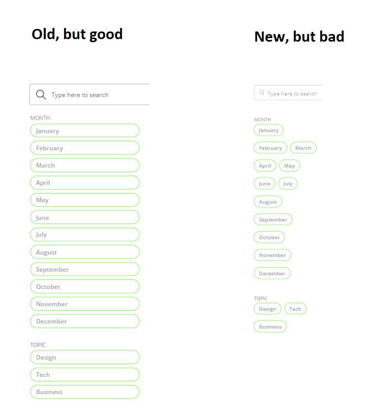
I was using the events listing template, that has the “List with vertical cards and tag” block. It had inline filters on the left hand side, each on a new row and with a fixed width for the button. When I updated the block to the latest version, all the filters have variable width depending on how long the label is. If there is space, then there are many filters in a row.
Is there a way to avoid this and have 1 filter per row with fixed width? Noticed also that when adding the block again, then the preview shows the result I want, but when adding it, the tags run into each other as described above.
Well, the new way is clearly not “bad” as it is a right design pattern, though a choice could be offered to Softr users to choose between one or another pattern, one day, maybe.
Sure, different design patterns and meant “bad” in a subjective sense for my use case.
For e-commerce sites, I would have thought the industry standard is max 1 filter per row to improve eye-scanning speed for users. After a quick search, I couldn’t find any e-commerce sites where it’s done differently. True, it’s generally checkboxes instead of chips, but right now, it’s either chips or dropdown on Softr.
Would be very happy with an option have them full width, like they are in block previews.