Hi community,
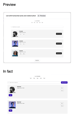
We need your help. We’re looking to use a list-block called ‘List with horizontal cards and visible button’. On the preview, it looks like picture no. 1, but in fact, it looks like picture no. 2:
As you can see, the button and tags are positioned incorrectly compatted to the preview. We love how the block looks on the preview, and this is exactly what we need. Any idea if it’s a bug, or if there’s something else we haven’t noticed?
We’ll appreciate your help,
Thanks!
